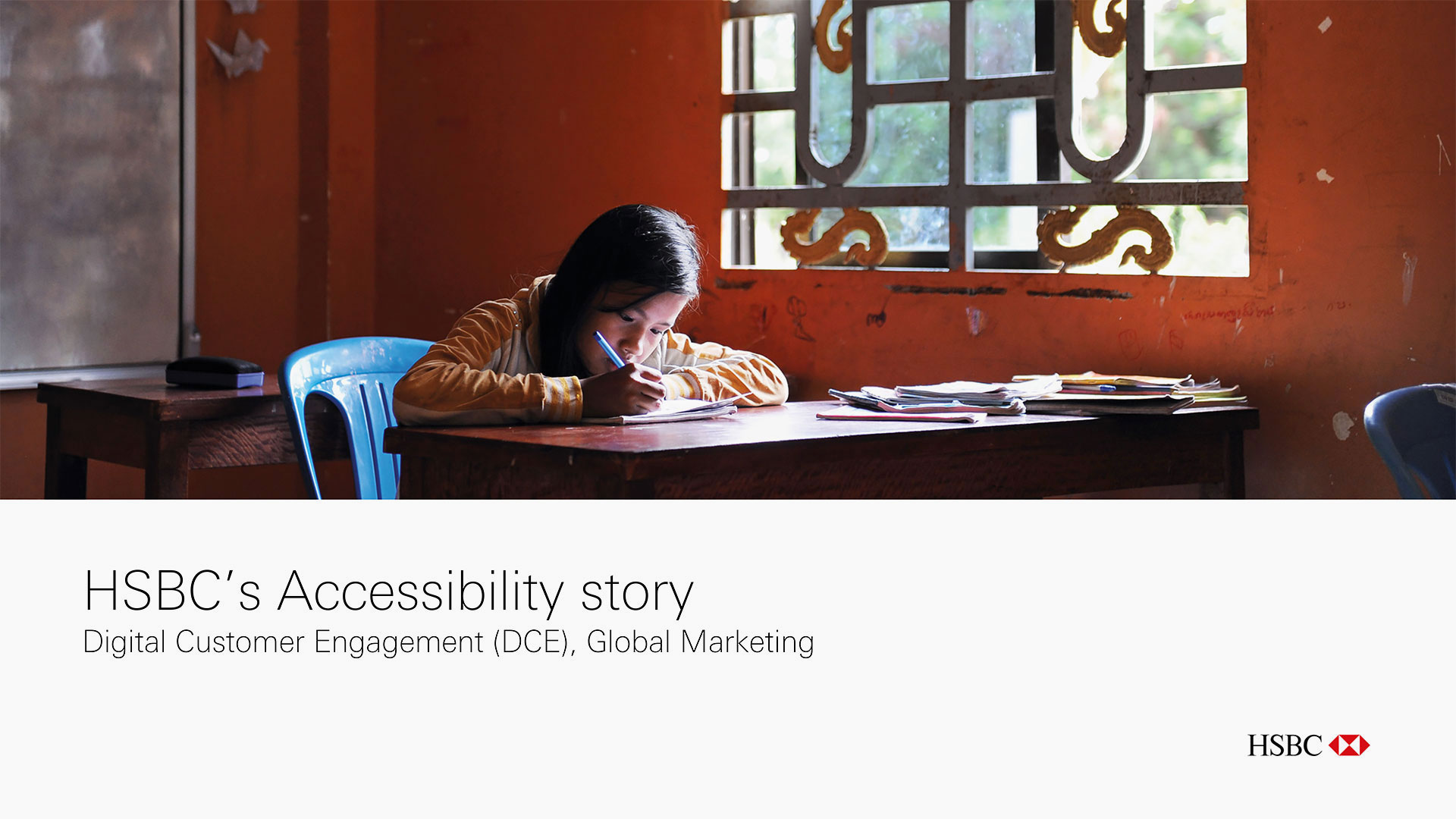
HSBC
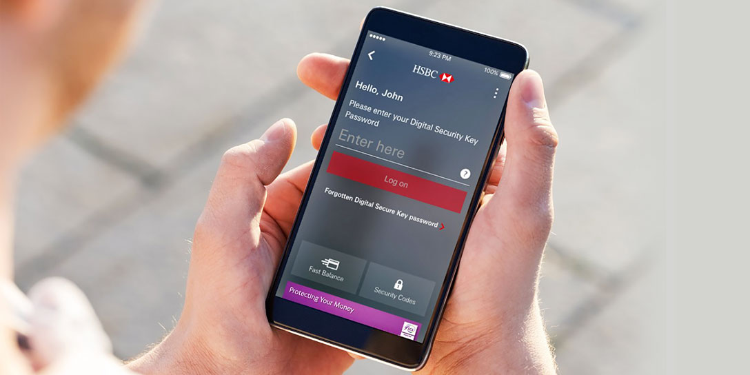
Banking mobile app (B2C). Freelance project, London.
Business context: Financial services / Client: HSBC UK / My role: Manage and execute the project as a Consultant/UX Designer / Target audience: HSBC customers, including people with disabilities

I worked closely with the digital design department within HSBC to align and create new standards where needed across the mobile banking app and responsive platforms for retail and corporate banking.
The final scope of this project was three months (fixed-term contract), and it followed the UX best practices for both iOS and Android at this time, especially regarding accessibility guidelines for people with disabilities.

There are 14.6 million disabled people in the UK. 21% of working age adults are disabled. More than 4.7 million disabled people are in work. 1 in 3 disabled people feel there’s a lot of disability prejudice. The disability employment gap is 29%
+ info
Mobile Accessibility
First, I requested documentation related to accessible mobile experience. Many developers were never taught best practices for mobile accessibility or never had access to these guidelines and the right resources. Or sometimes, fixing accessibility issues is a goal pushed to “later”.
Either way, people with disabilities are affected. They want to bank, shop, read the news, and talk with friends and family online… but they can’t always do it. Therefore, this information is key to provide an experience that can be used by someone with a disability:
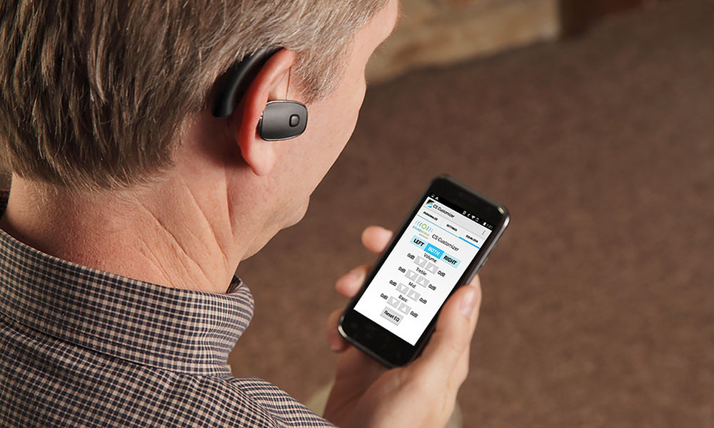
Hearing impairment
Someone who is hard of hearing and turns on captions when watching videos.
Visual impairment
Someone who is blind or deaf-blind and uses software to read websites and apps out loud.
Mobility impairment
Someone who uses voice command software instead of his / her finger to tap on the screen.
HSBC Mobile Accessibility Guidelines
These guidelines established a set of principles when designing and building native app interfaces. Their definition fit into other documentation and inform accessibility consideration across mobile product delivery. However, the documents shown below were not updated, so I also researched about new UX trends available by then.
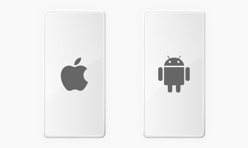
iOS vs Android Accessibility
It addresses a wide range of issues such as touchscreens, small screen sizes, different input modalities (including speech and 3D touch enabled by pressure sensors), device use in different settings like bright sunlight, and more.
For example, a blind person uses VoiceOver on iOS to interact with a mobile phone while a hearing impaired person uses Live Transcribe on Android to have conversations through instant speech-to-text captions.
HSBC Mobile Toolkit
The toolkit structure consisted of four main files which were Library, Icon Set, Design Toolkit and Specifications, with all the signed off elements, colours, font styles, patterns and templates plus some guidance on how to use them.
In addition, the HSBC Global Digital Standards contained standards structure for elements, patterns and templates. It was intended to help find the information quickly by using plain language for people across multiple job roles.
1 Foundations
I defined Foundations and Components for a more a detailed and complete mobile toolkit with mobile accessibility in mind, supported by visual examples carefully explained and links to further information.
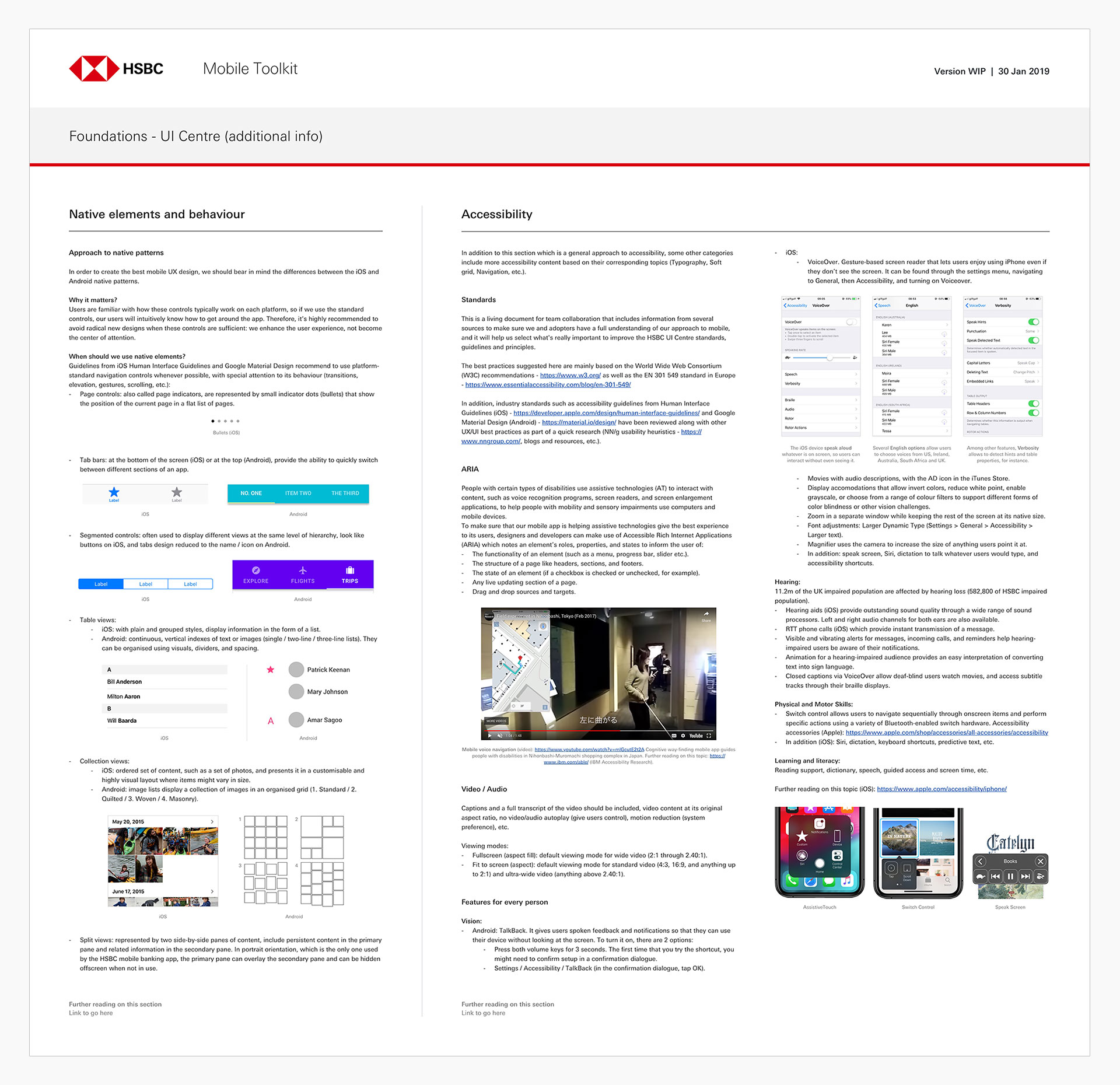
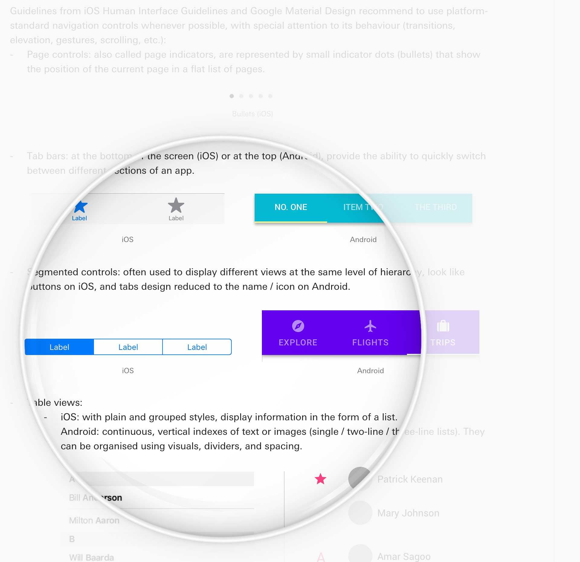
1.1 Native elements and behaviour / Accessibility
This study started with a general approach to native patterns (see magnified view below), as well as industry standards such as accessibility guidelines from Human Interface Guidelines (iOS) and Google Material Design (Android).
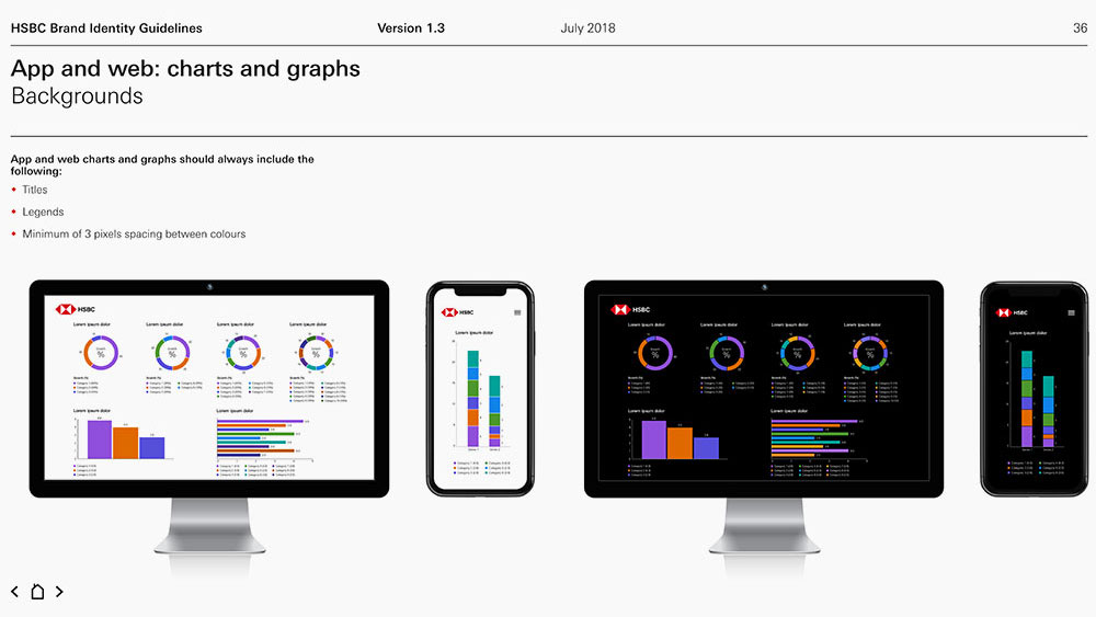
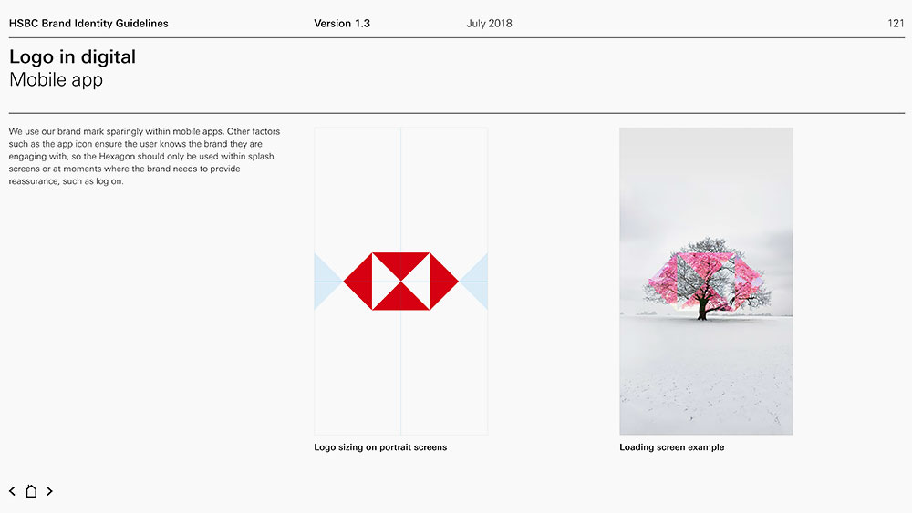
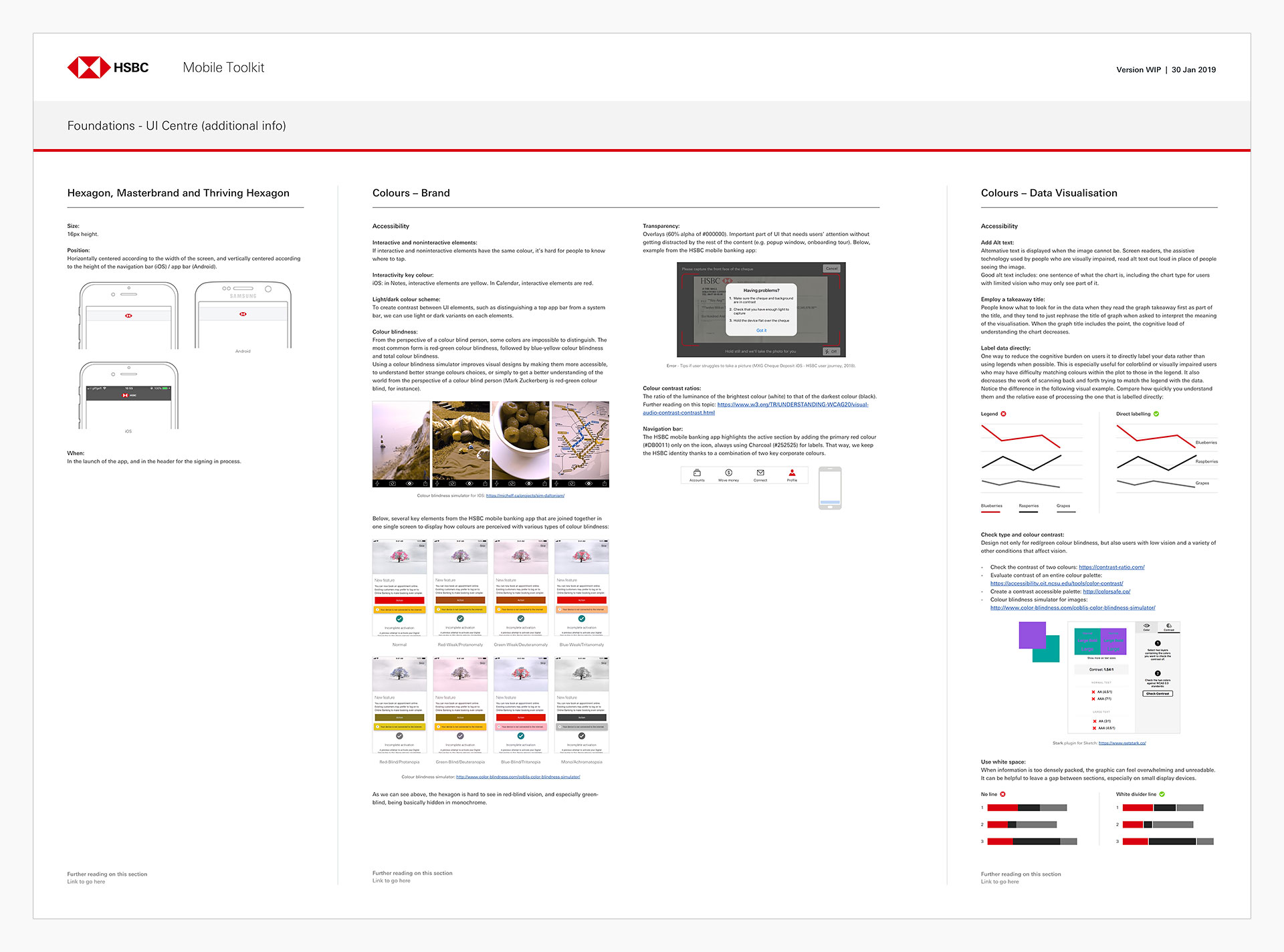
1.2 Hexagon / Colours (brand and data visualisation)
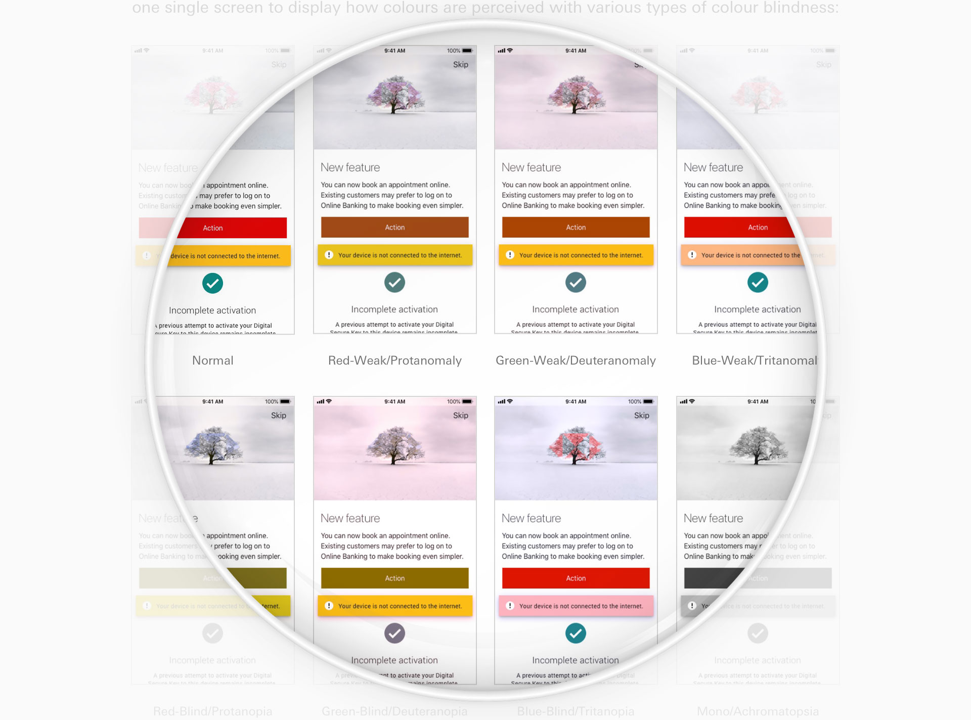
In addition, I tested several key elements from the HSBC mobile banking app that were joined together in one single screen to display how colours were perceived with various types of colour blindness (magnified view). Data visualisation, Colour contrast, and the using of White space to improve readability on mobile devices were described with clear and simple examples too.
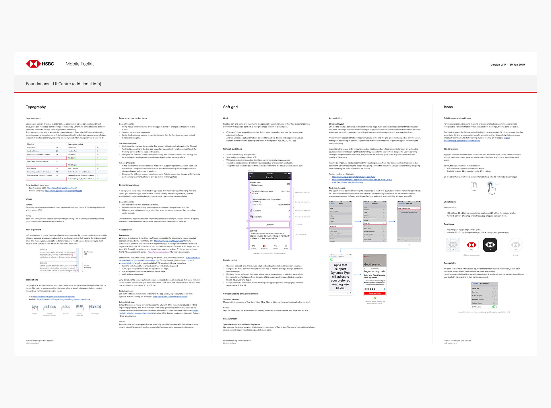
1.3 Typography / Soft grid / Icons
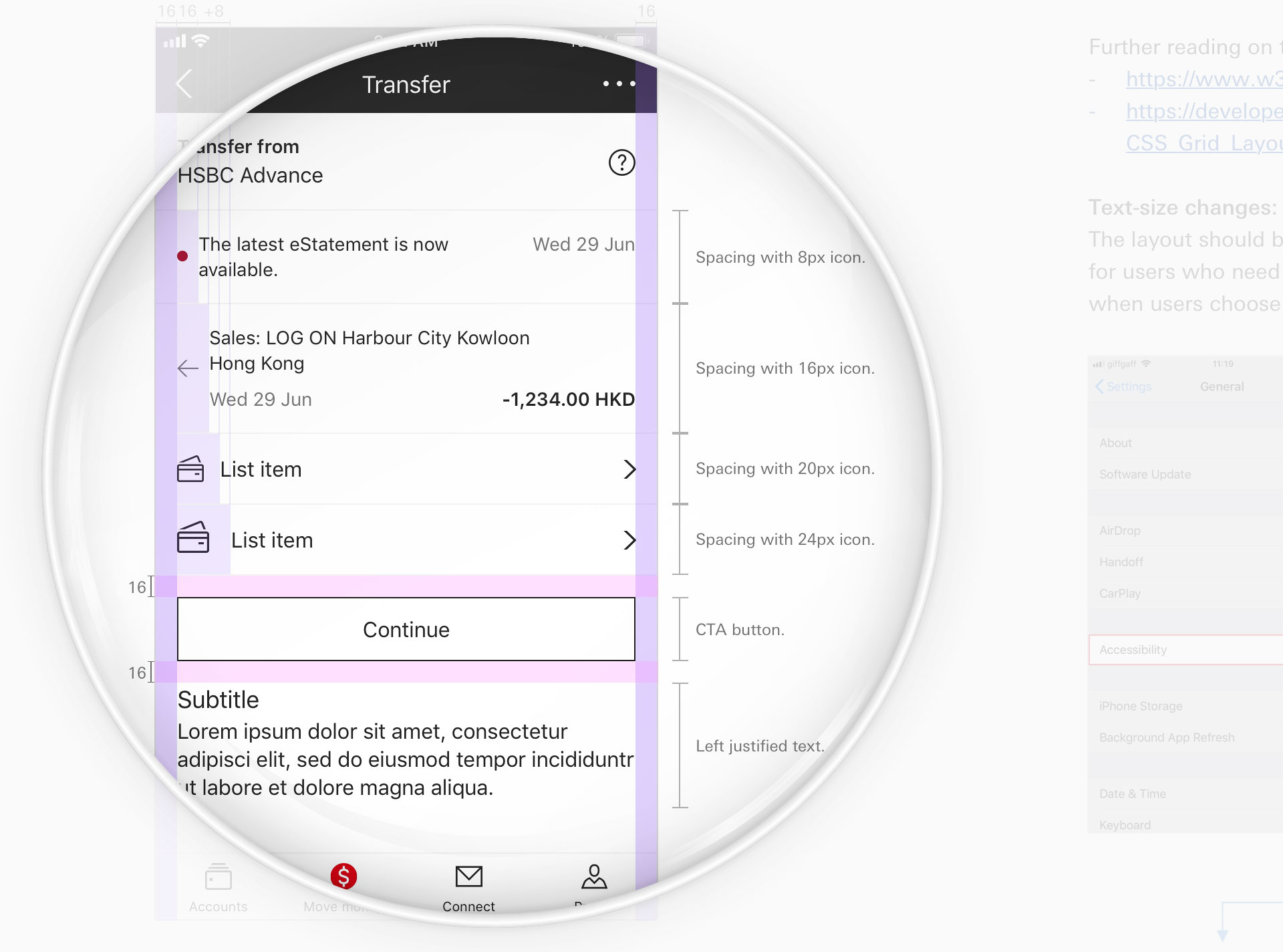
I decided to add several improvements to the type system related not only to leading and tracking, but also a wider range of styles to cover all the test scenarios, among other topics. In the image below, general guidelines for a 8pt soft grid system.
2 Components
This is a collection of elements, visual examples and guidelines designers and developers should follow to ensure that the HSBC Mobile Accessibility Guidelines will create a cohesive experience at the end.
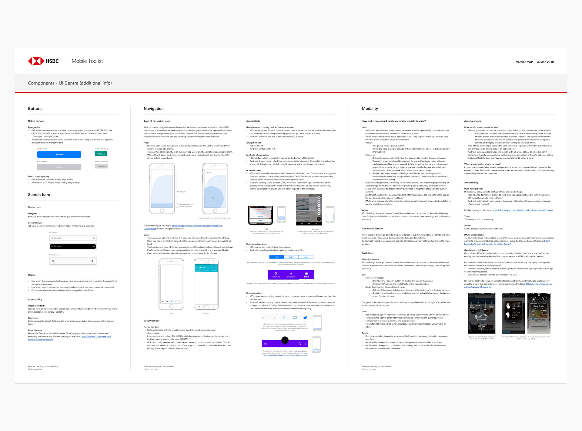
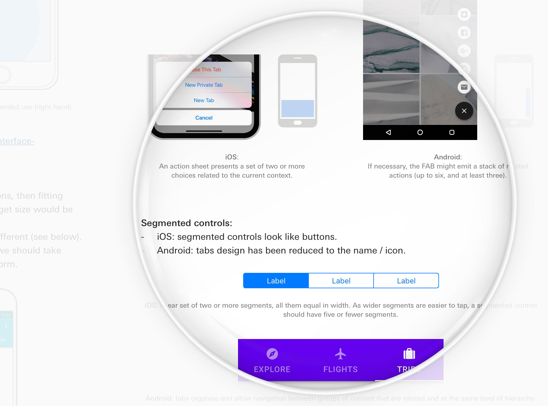
2.1 Buttons / Search Bars / Navigation / Modality
Best practices and guidelines around a wide range of components are supported by do’s and don’ts guidelines. Native elements are displayed along with its position on the screen (magnified view), highlighting the differences between iOS and Android with accurate descriptions.
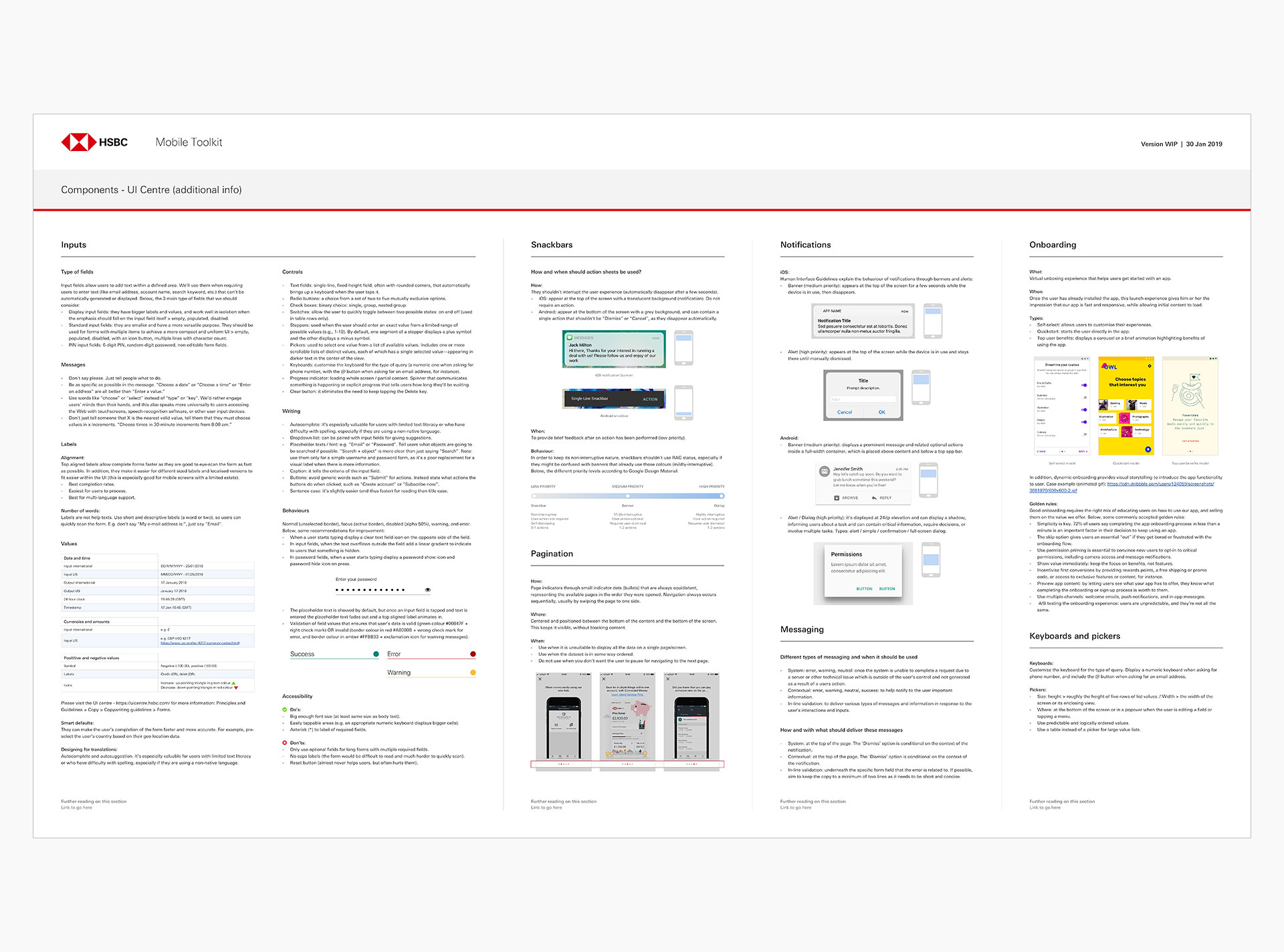
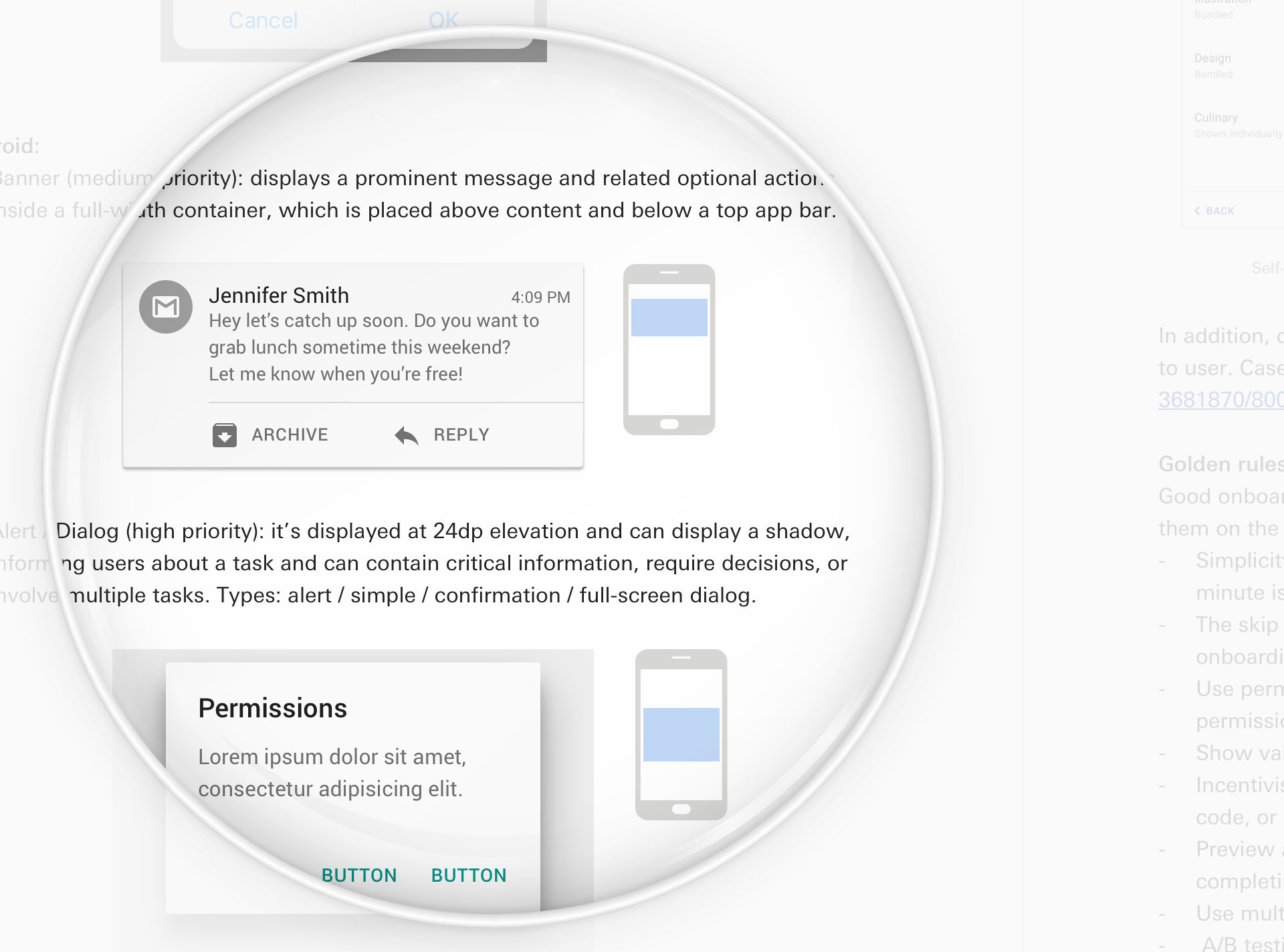
2.2 Inputs / Snackbars / Pagination / Notifications / Messaging / Onboarding / Keyboards and pickers
Following the above, many other elements display descriptions and placements of interaction (magnified view). Both Foundations and Components are aimed to create the right balance between brand consistency and maximal use of limited screen space, besides boosting the value of inclusive design.
Evaluation
I couldn’t be more proud of this project. It has a huge positive impact on HSBC customers globally, and helps people with disabilities better interact with its banking mobile app. There is no better way to enjoy the design work than to make people’s lives simple, and this promise is even more evident here.