
Premium Bank
Mortgage mobile website (B2C & B2B). Freelance project, London.
Business context: Redesign of the mortgage application process in the financial services industry / Client: Burrow, as part of Finova / My role: Product Designer / Target audience: Borrowers as well as mortgage advisers who enable them to achieve their financial goals

I worked closely with the Director of Digital Solutions and the Technical Product Manager through an end-to-end approach. The project was delivered over a three-month fixed-term contract. We followed an MVP strategy to develop a working product that delivered immediate value while minimizing costs.
1 Research
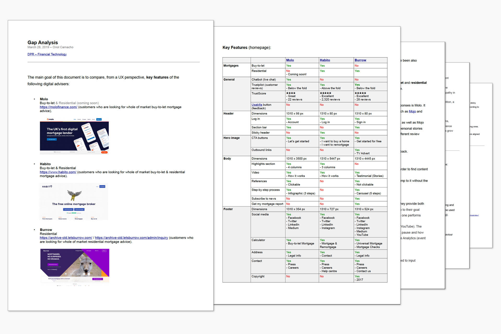
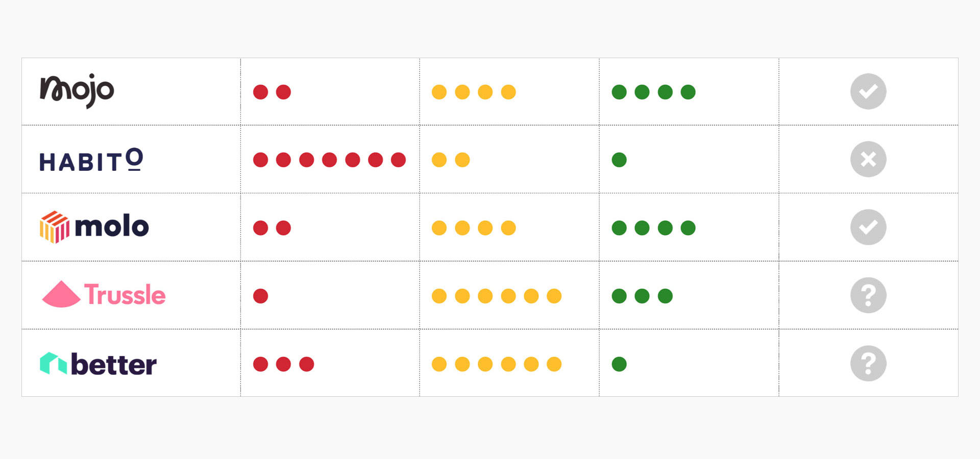
The main goal was to understand the product’s current performance as well as user feedback. First, a gap analysis was conducted to identify and compare key features across several digital advisers, categorising usability best practices into distinct groups.
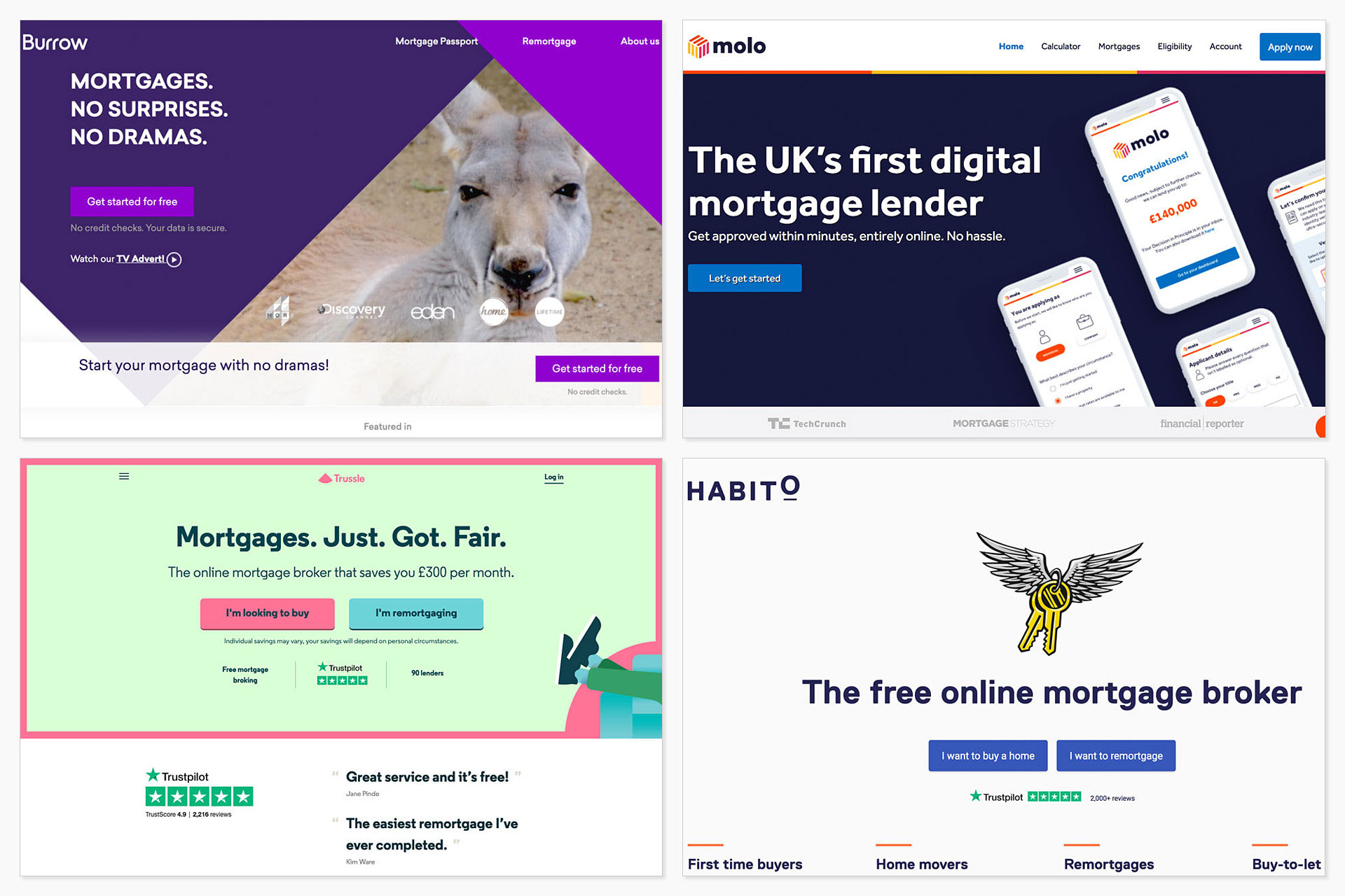
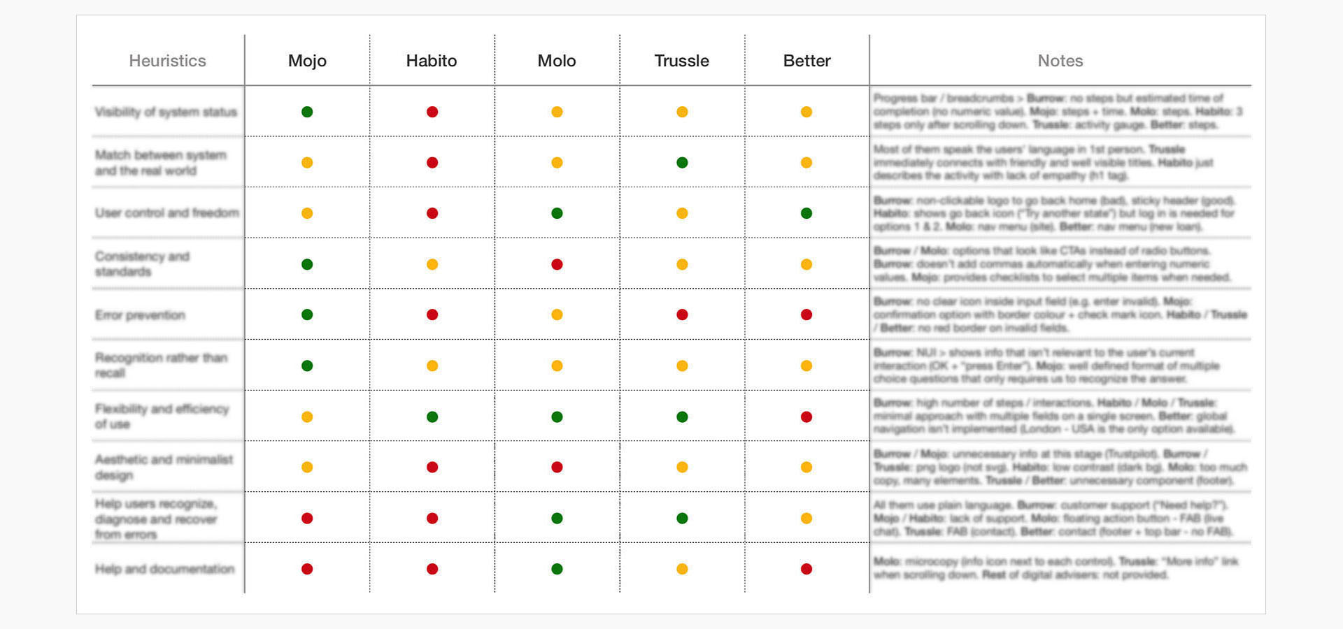
After that, a heuristic evaluation of selected competitors helped identify usability issues, drawing on two main sources: the Nielsen Norman Group and Interaction Design Foundation.
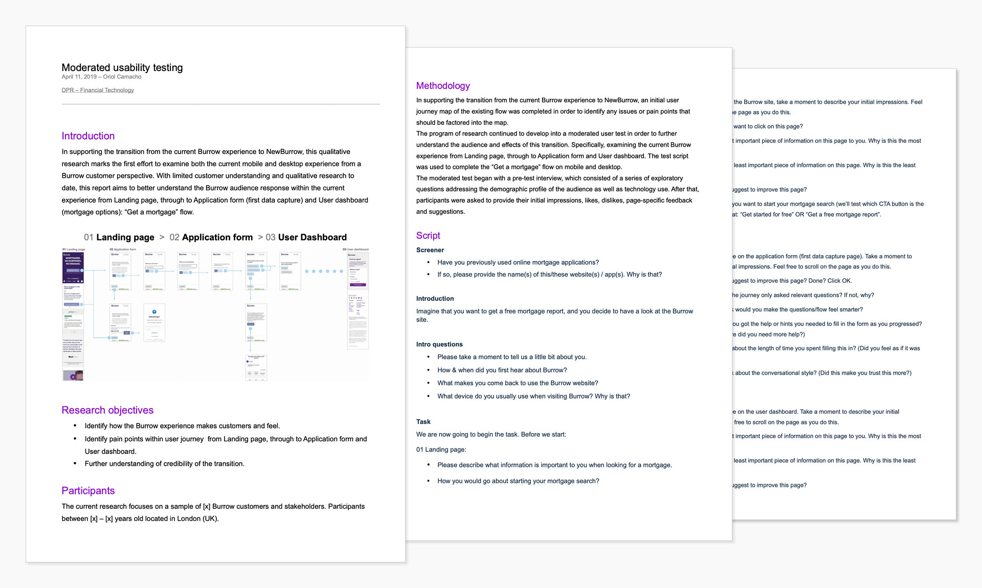
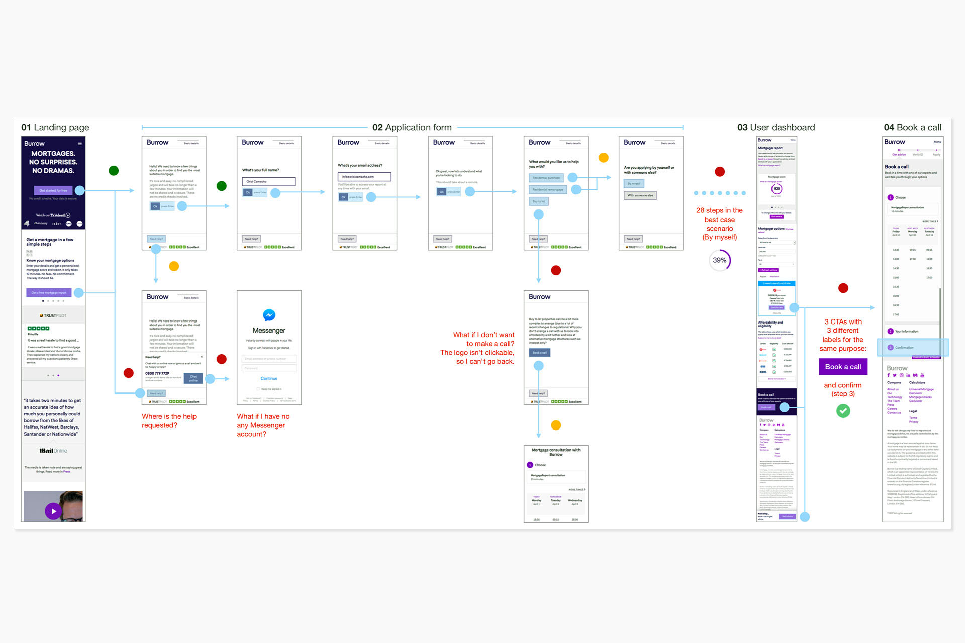
Moderated usability testing was highly valuable in evaluating the mobile experience end to end, from the landing page through the application form (initial data capture) and into the user dashboard (mortgage options). The participant sample included both customers and stakeholders.
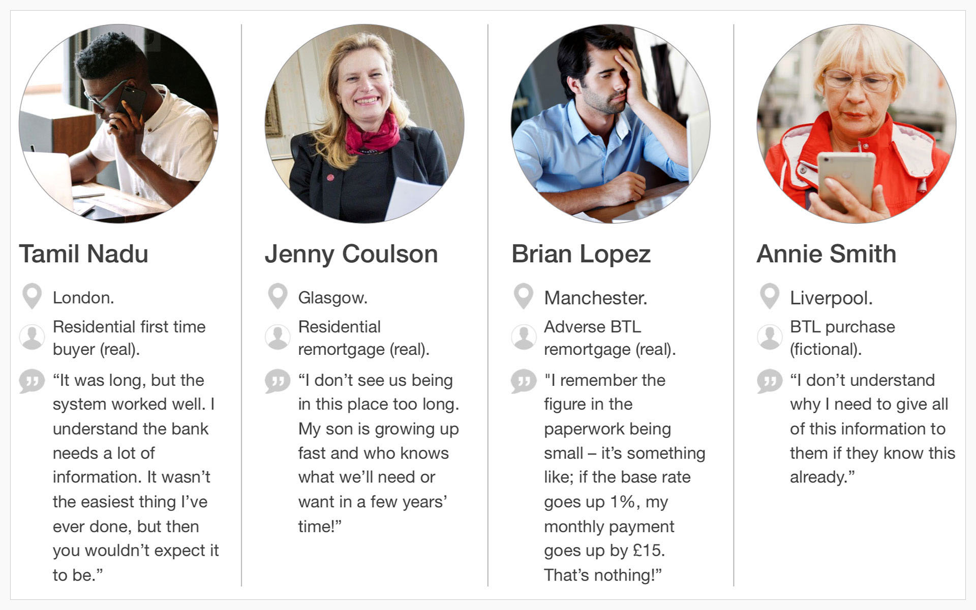
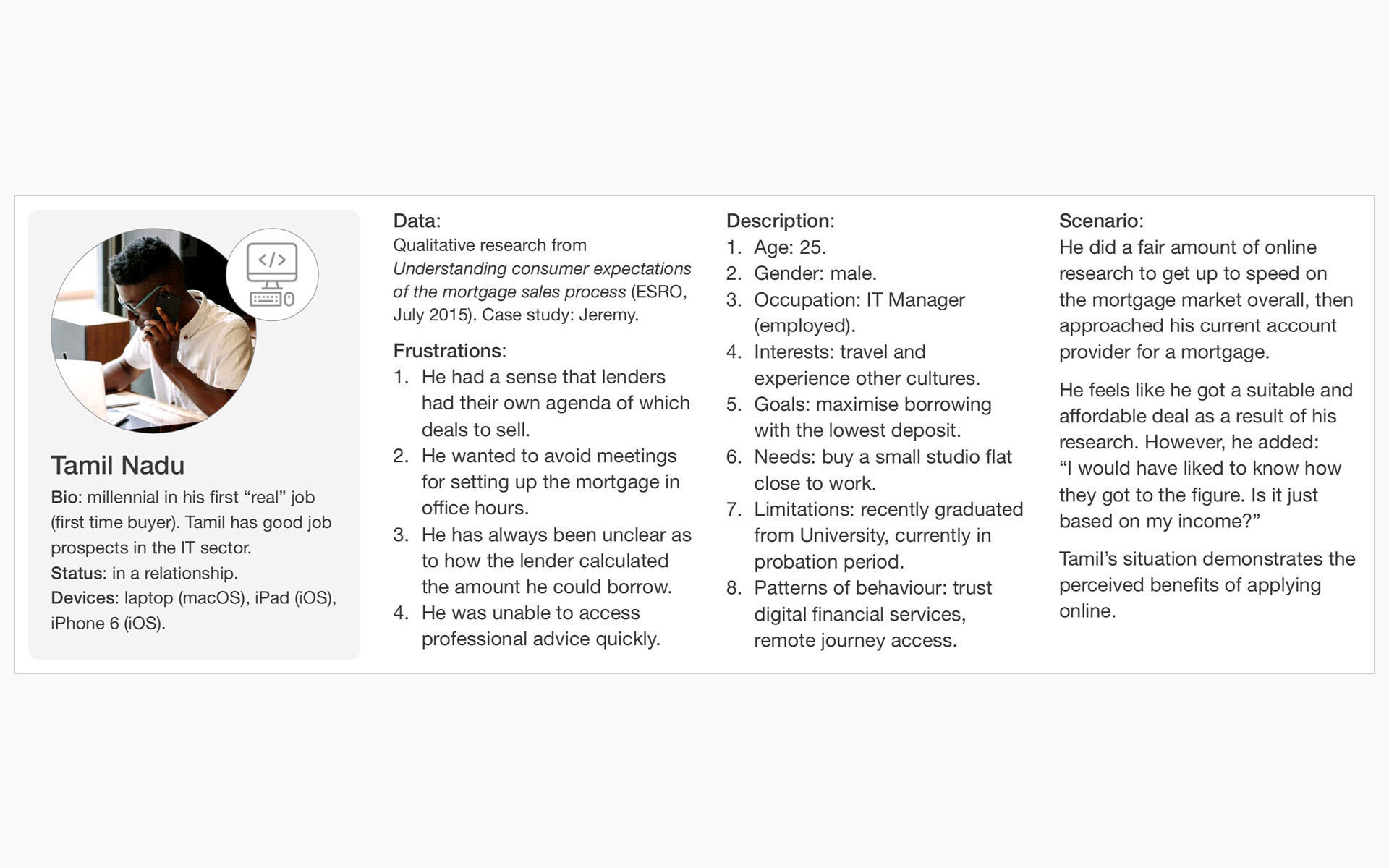
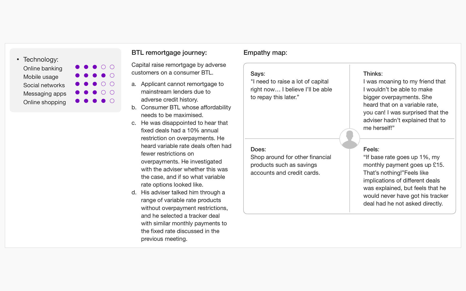
Finally, we developed four user personas (borrowers) representing users of lender-advised journeys within Tier 2 banks, to clearly define who the user journey was designed for (B2C).
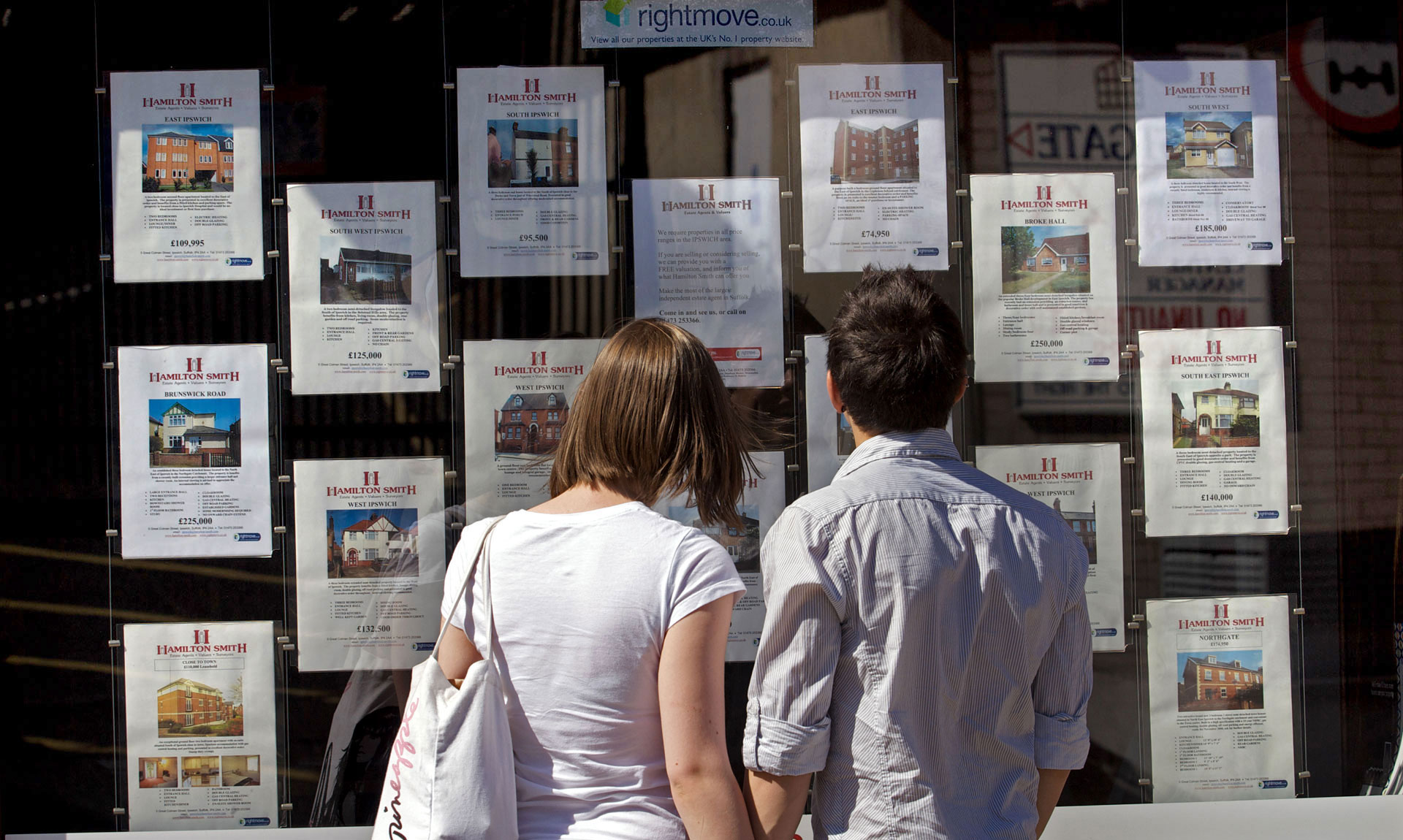
Our primary focus was first-time buyers seeking to understand how much they could afford to borrow, as this directly influences what and where they can purchase. In addition, we included personas based on well-known mortgage advisers in the UK to better reflect the platform’s intended B2B user base.
2 Strategy
In this second stage, we consolidated the information gathered to define the problem. We analysed our observations to identify features, functions, and other elements that would enable users to resolve issues independently with minimal difficulty.
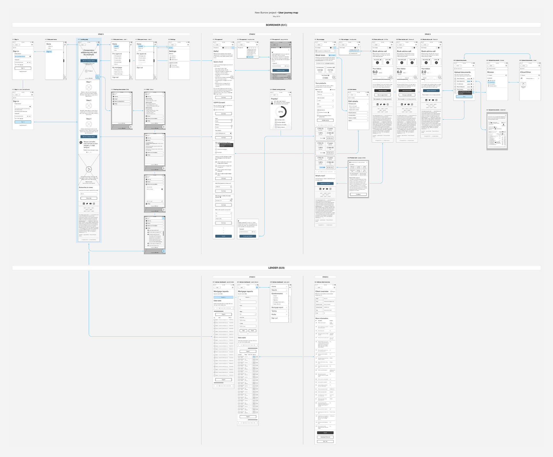
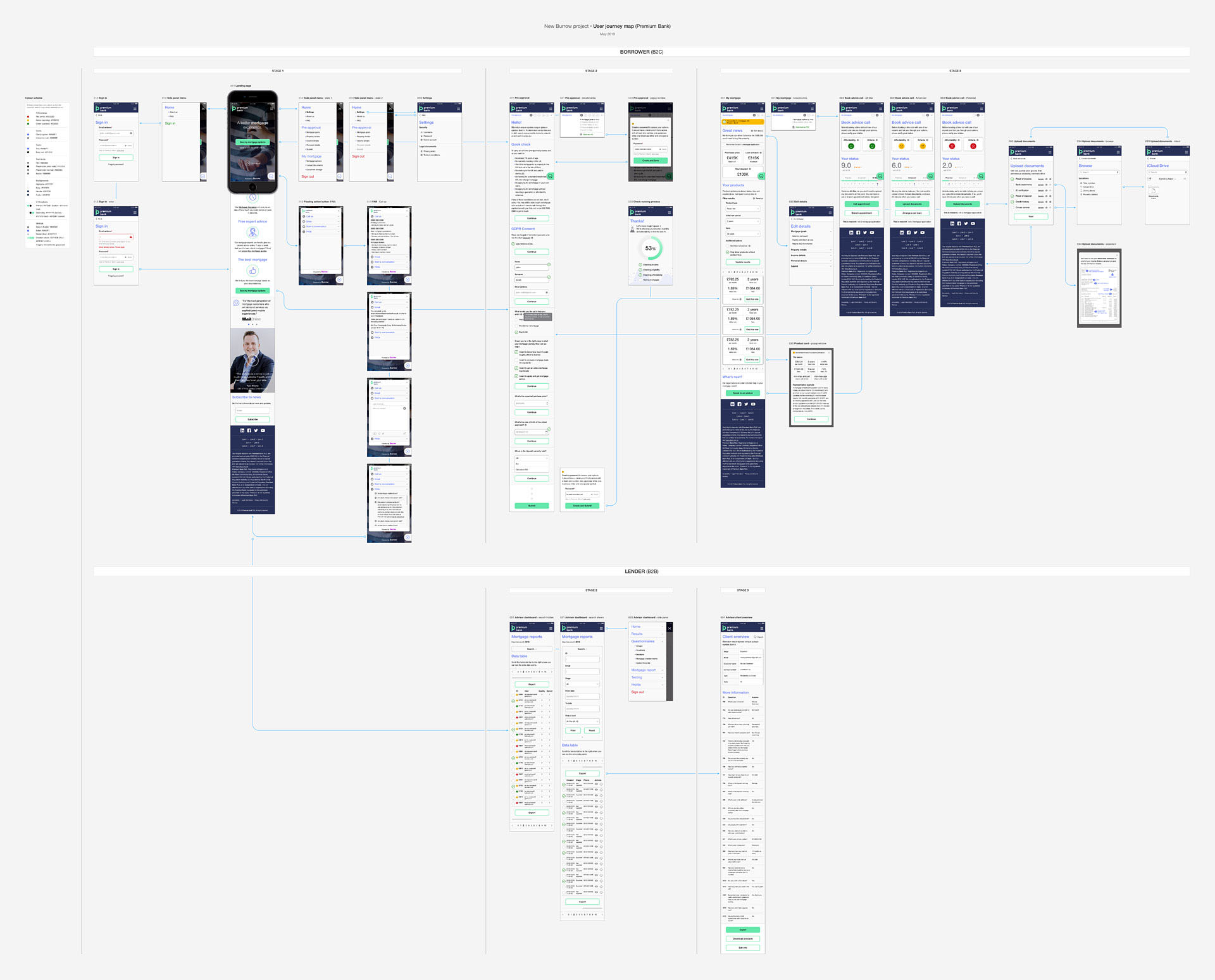
We held several brainstorming sessions as a multidisciplinary team to define the user journey map and make key decisions through an iterative, collaborative process.
This is the problem statement: first-time buyers who need to find the best possible mortgage deal in order to maximise their savings.
The user journey took too long to complete, particularly within the application form. In addition, many users struggled to understand the system status, indicating a need for a progress indicator. To address this, we aimed to logically group input data, set clear expectations for users, and provide visibility into their progress throughout the journey.
3 Design
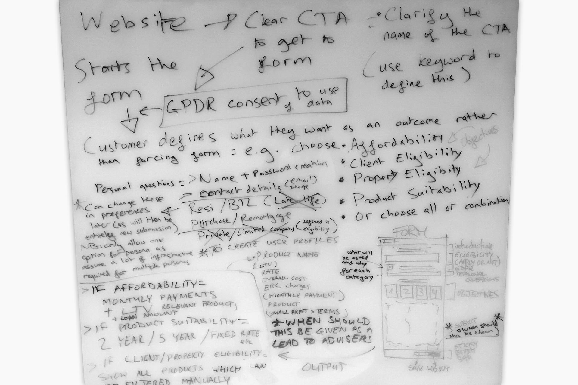
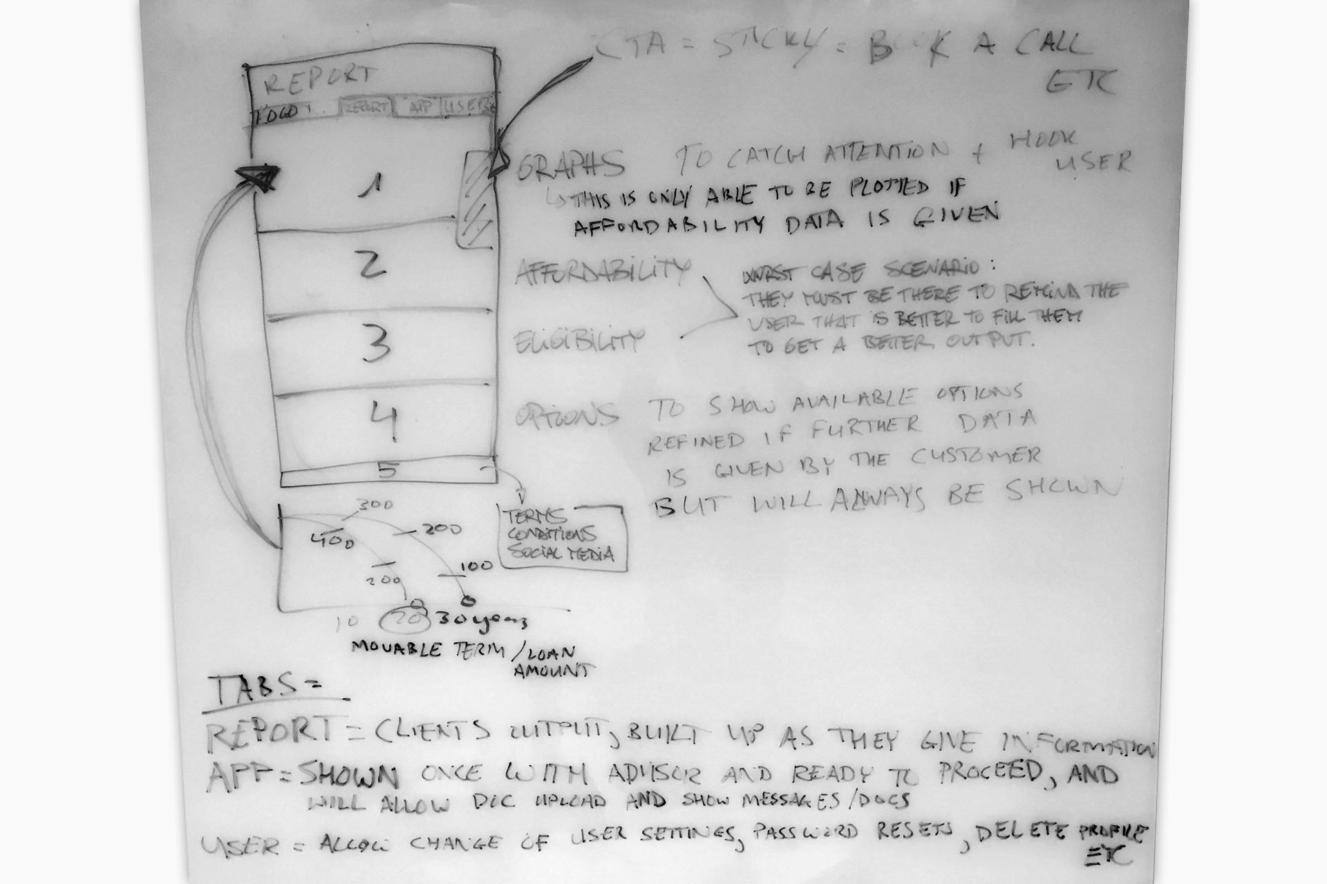
The ideation phase was enriched in the final stage with handwriting sketches to communicate ideas in a cost-efficient manner.
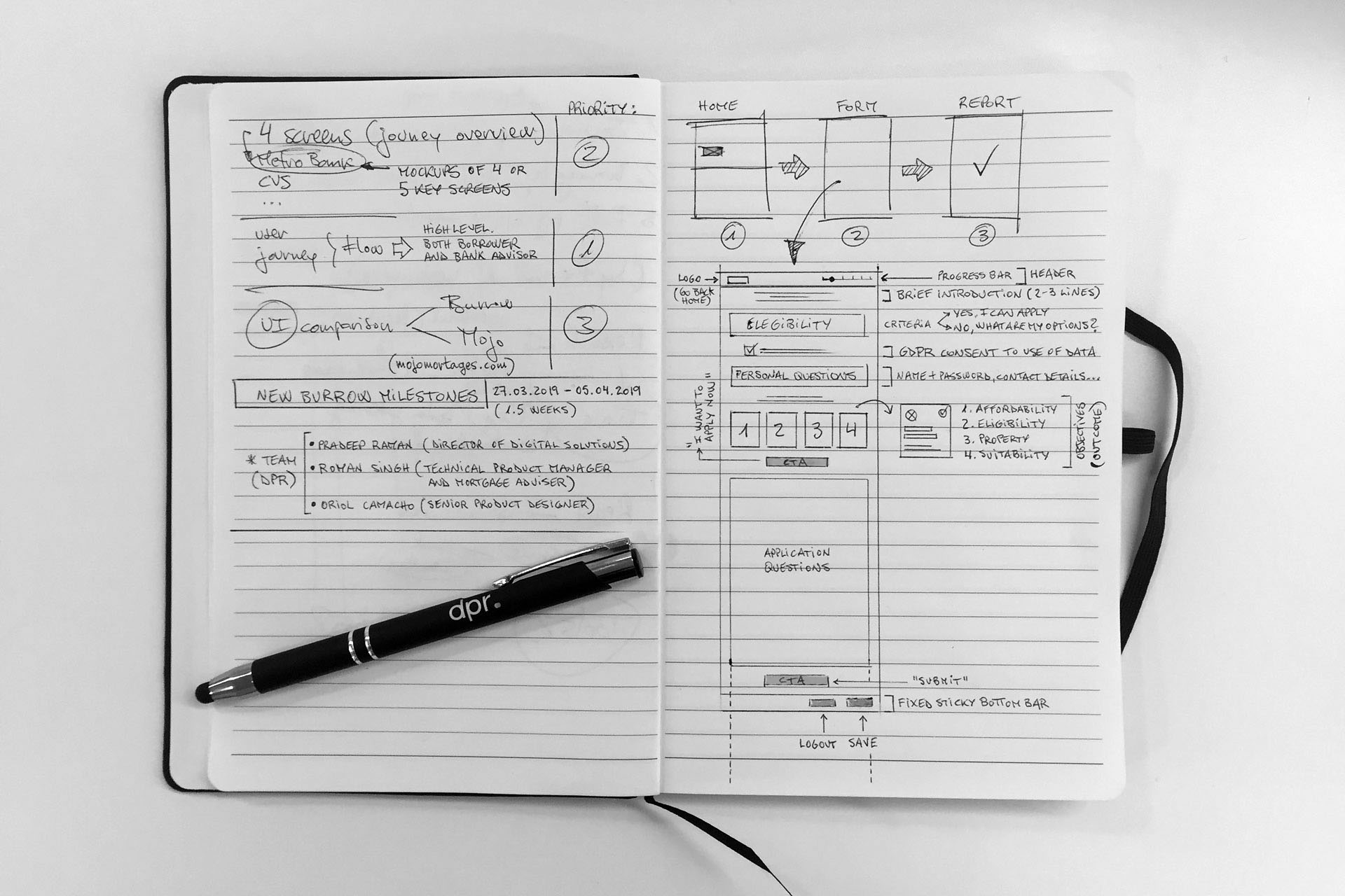
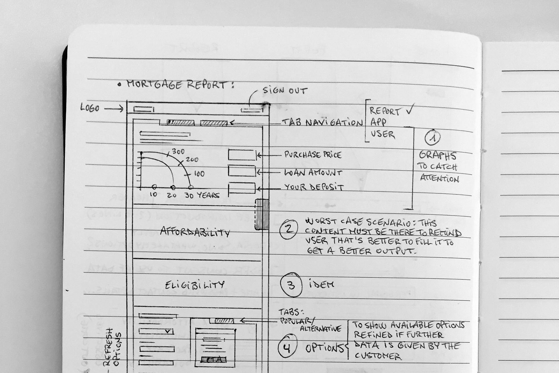
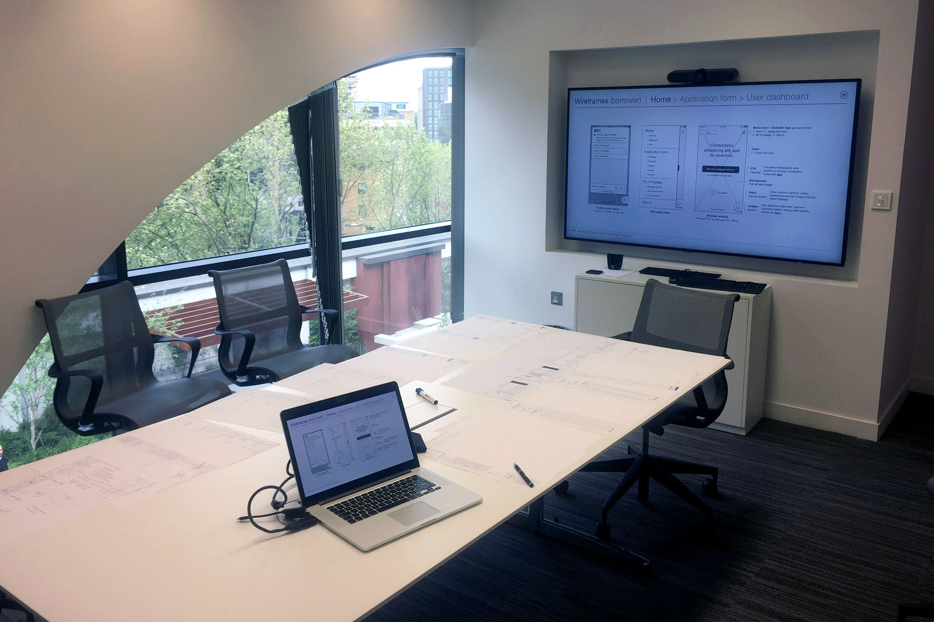
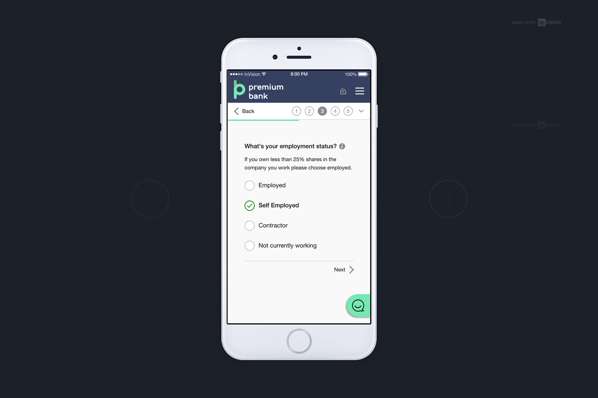
Wireframes were focused on space allocation and prioritisation of content, functionalities available, and intended behaviors. We also used them to get stakeholder and project team approval.
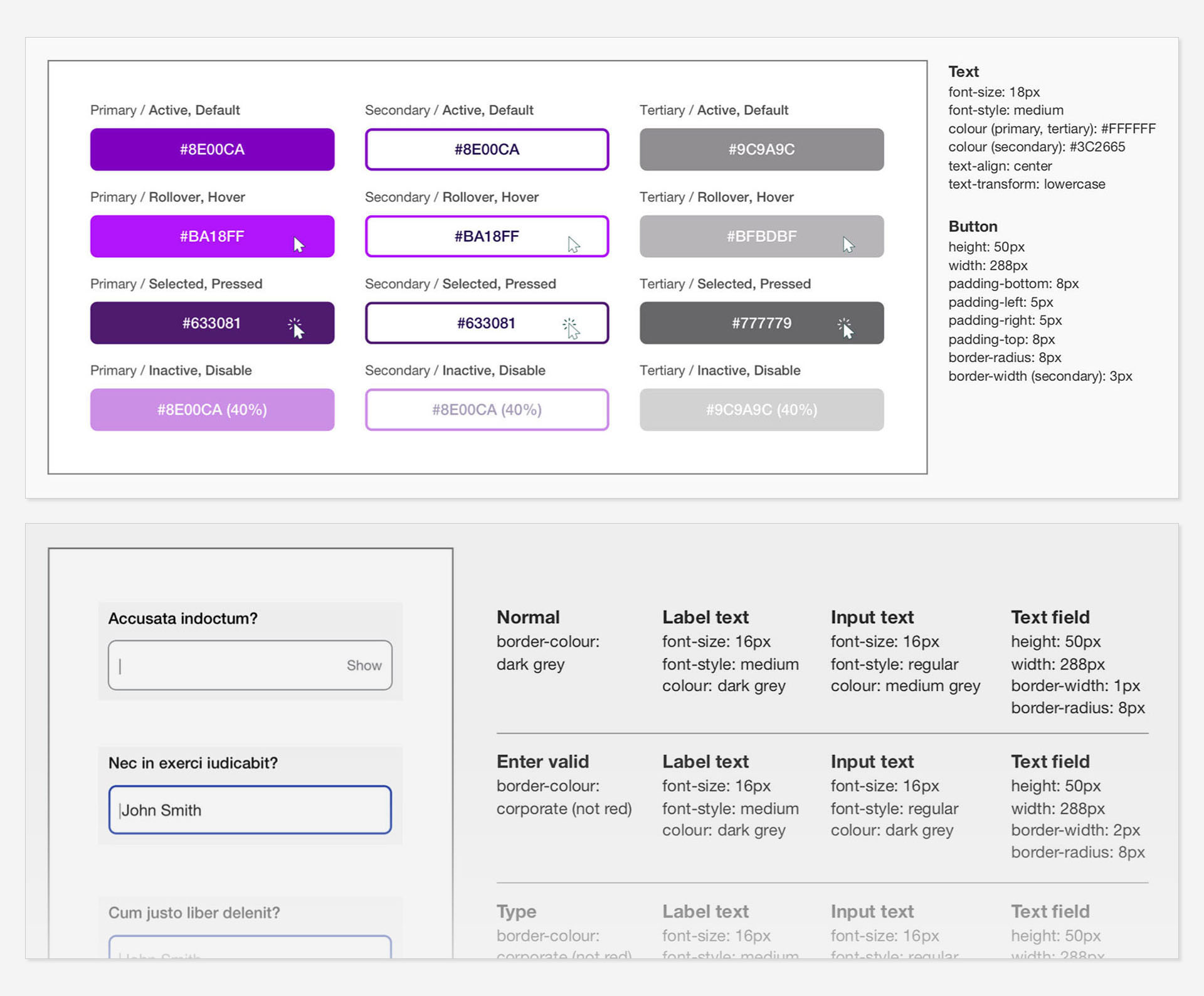
The MVP strategy also included a logo redesign optimised for digital use, making it more legible and less cluttered when placed in the website’s header. All components were designed following clear guidelines for implementation, including patterns, imagery, and layout structures.
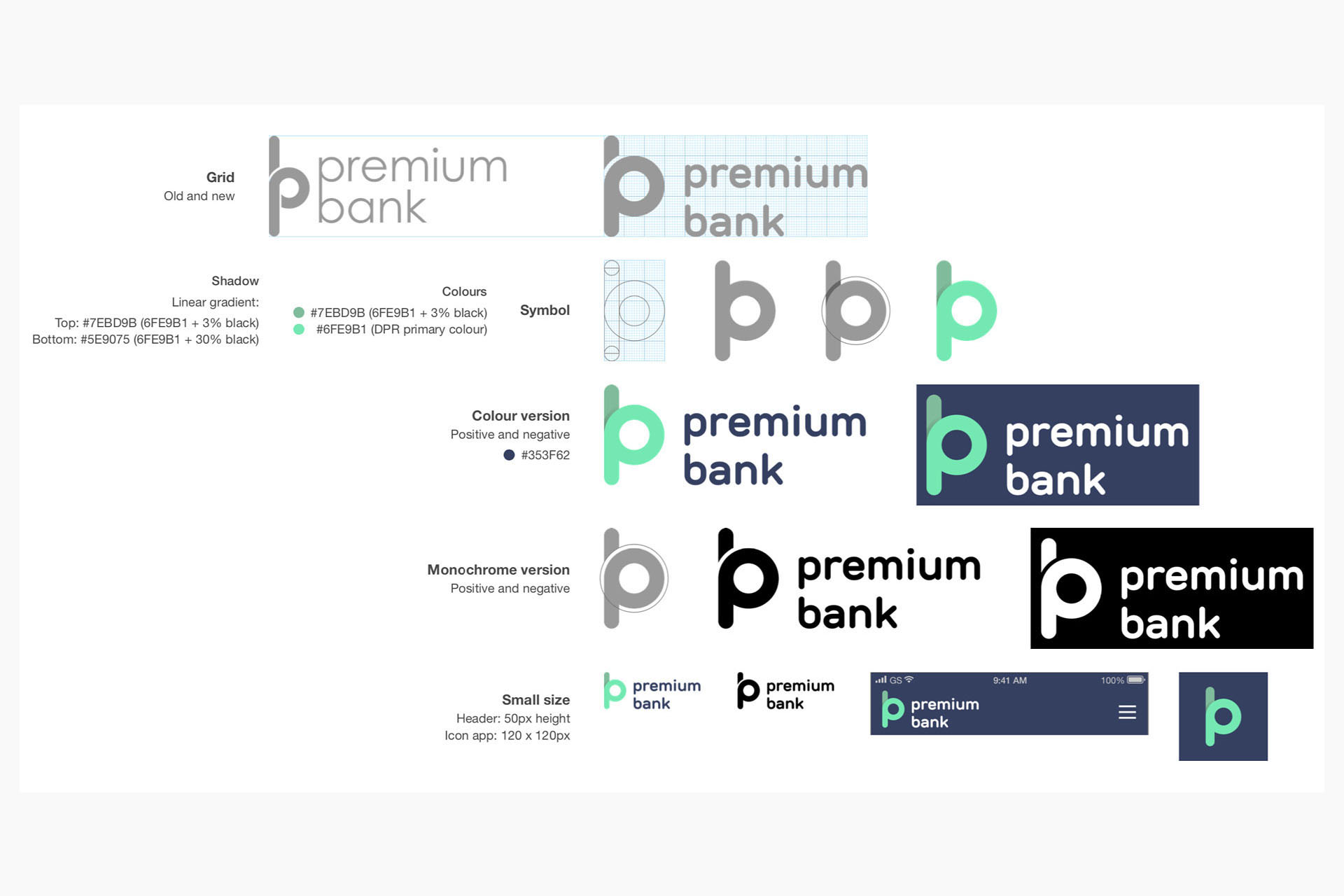
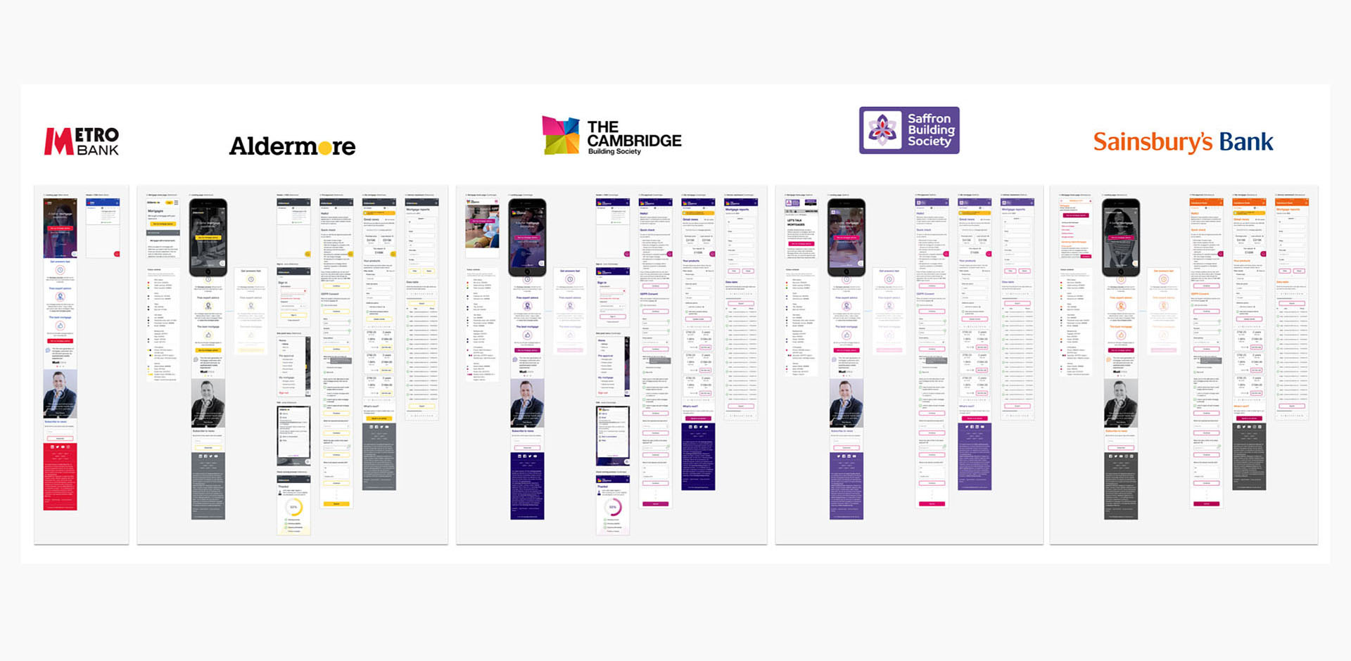
A white label design system was proposed to get a fully customized solution. Some variables would give customers enough freedom to create their own logo, neutral typefaces, icon styles, spacing, and more.
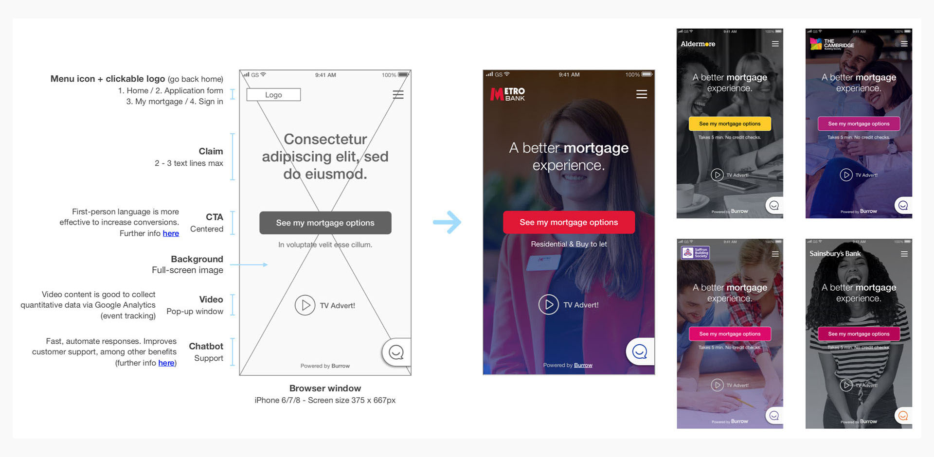
Mockups helped us make final decisions regarding the product’s color schemes, visual style, and typography. They also informed the definition of patterns (such as errors, warnings, and overlays) and components (including form inputs, checkboxes, and radio buttons), ensuring overall consistency across the experience.
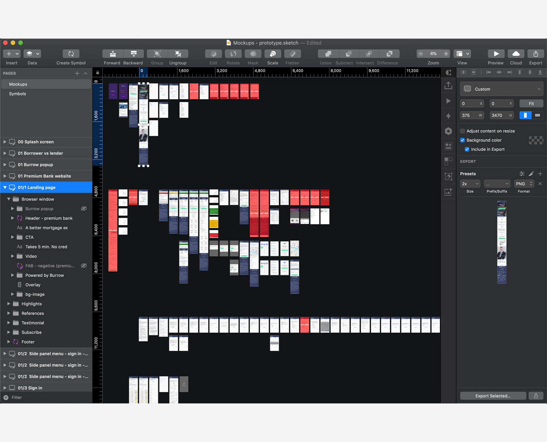
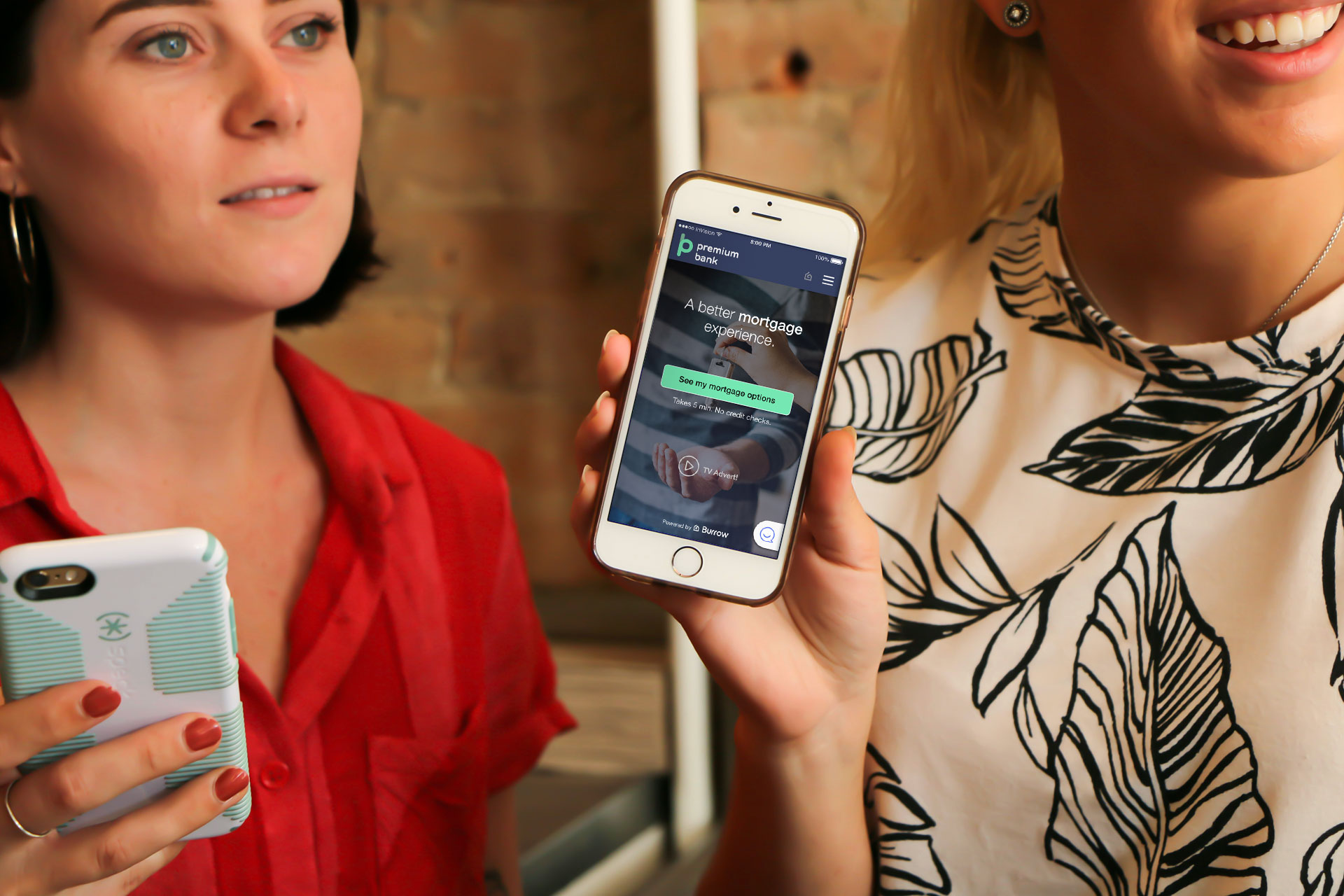
I finally used these mockups to create a prototype, allowing us to continuously test our assumptions in an interactive way. This proved particularly valuable for presenting ideas in a tangible form and for gathering feedback from potential customers.
Below is a video showcasing the landing page and proposed content as the user scrolls down (Stage 1). It also demonstrates different ways to get in touch, the sign-in flow, and other key features.
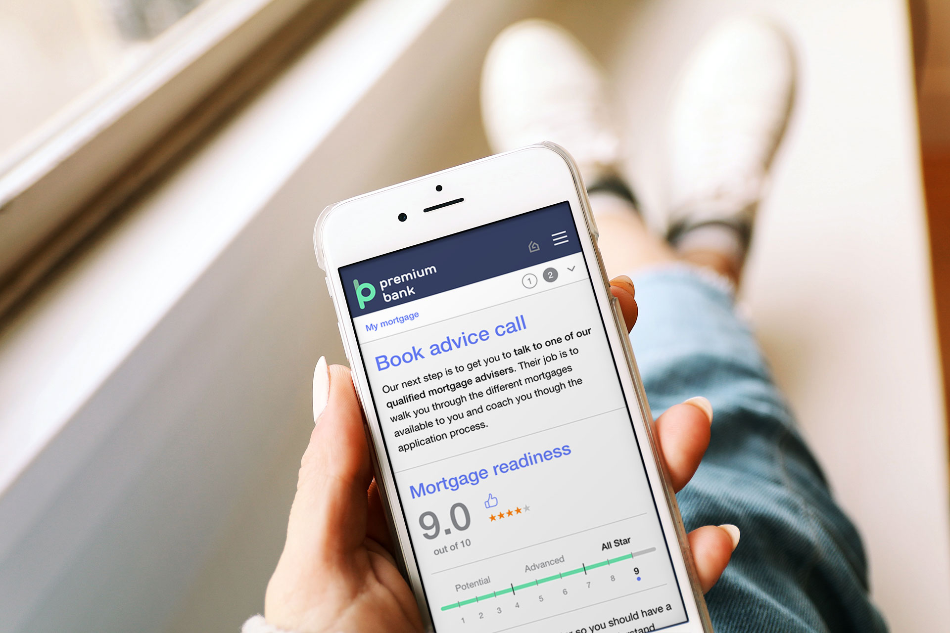
The B2C user dashboard (Stage 3) includes a product filter as well as a booking flow to connect with qualified mortgage advisers. It also allows users to improve their profile score by uploading additional documents, enabling them to receive better recommendations and save time later in the process.
Evaluation
Saffron Building Society, one of the case studies analized, adopted this solution in order to “better support tools for mortgage customers that result in better conversations and experiences”, according to Colin Field (Chief Executive Officer) → Read the full text of the article here.