Obi
Energy mobile app (B2C). Company project, London (2016).
Finalist UX category. The European Talent Awards 2017 – Aquent (London) → Read more
Business context: Utilities industry / Client: ONZO / My role: Manage and execute the whole project (E2E) as Lead Designer / Target audience: Families and 18-40 stakeholders
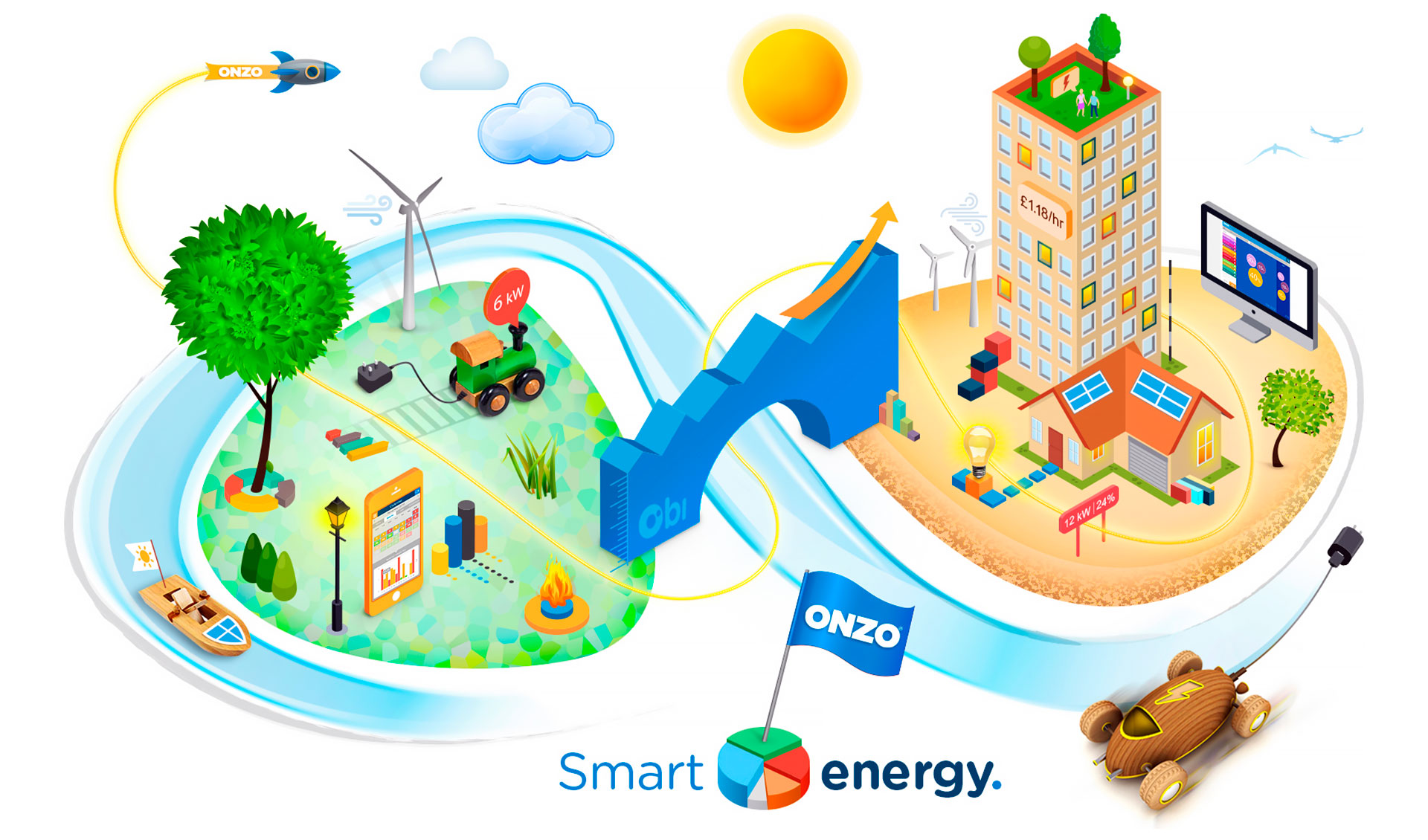
This energy saving mobile app empowers customers to take control of their energy use through real-time communications by transforming complex data information into real insight. The main goal was to engage new users, improve customer experience and provide the right information quickly and efficiently.
Research
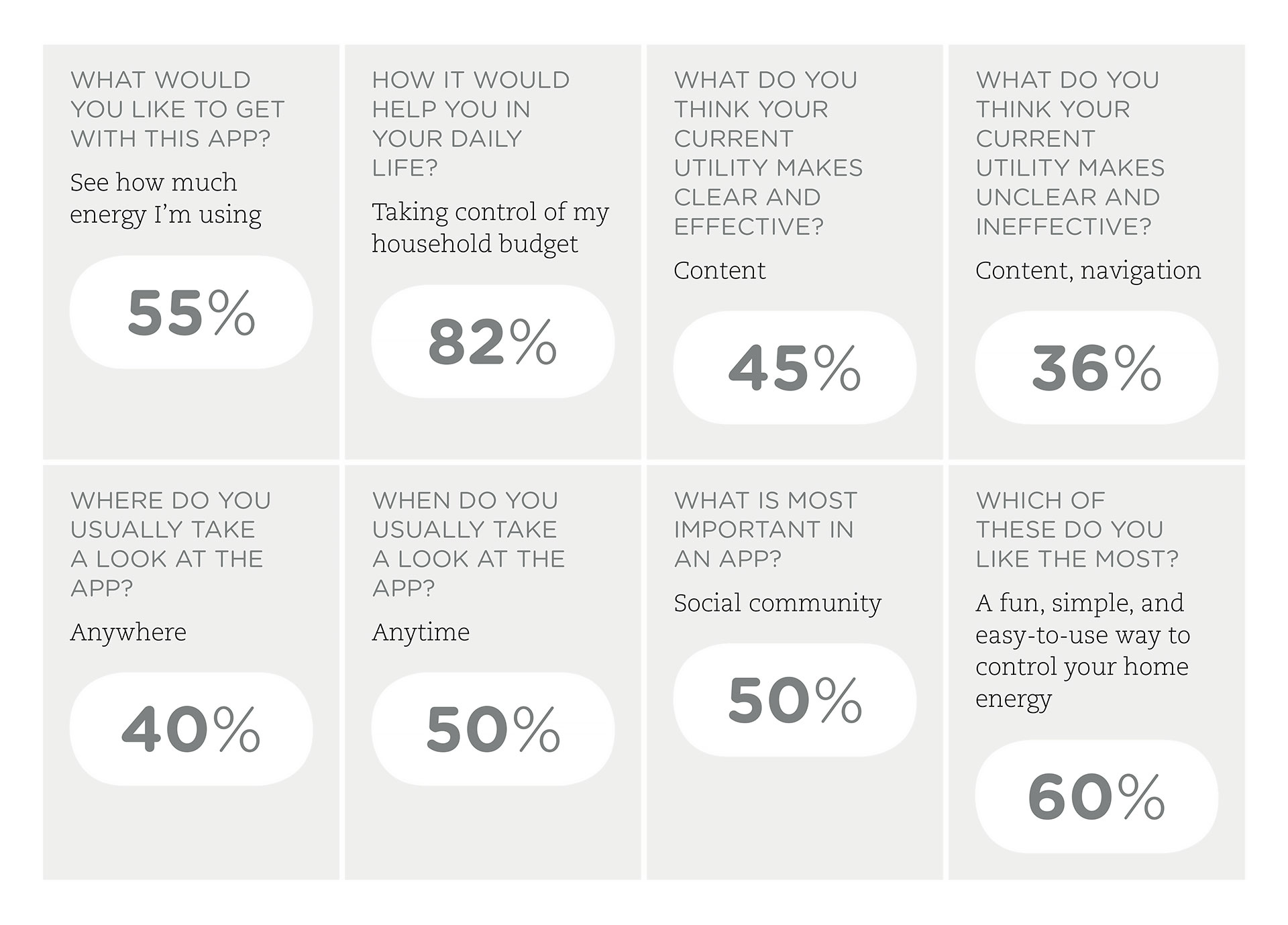
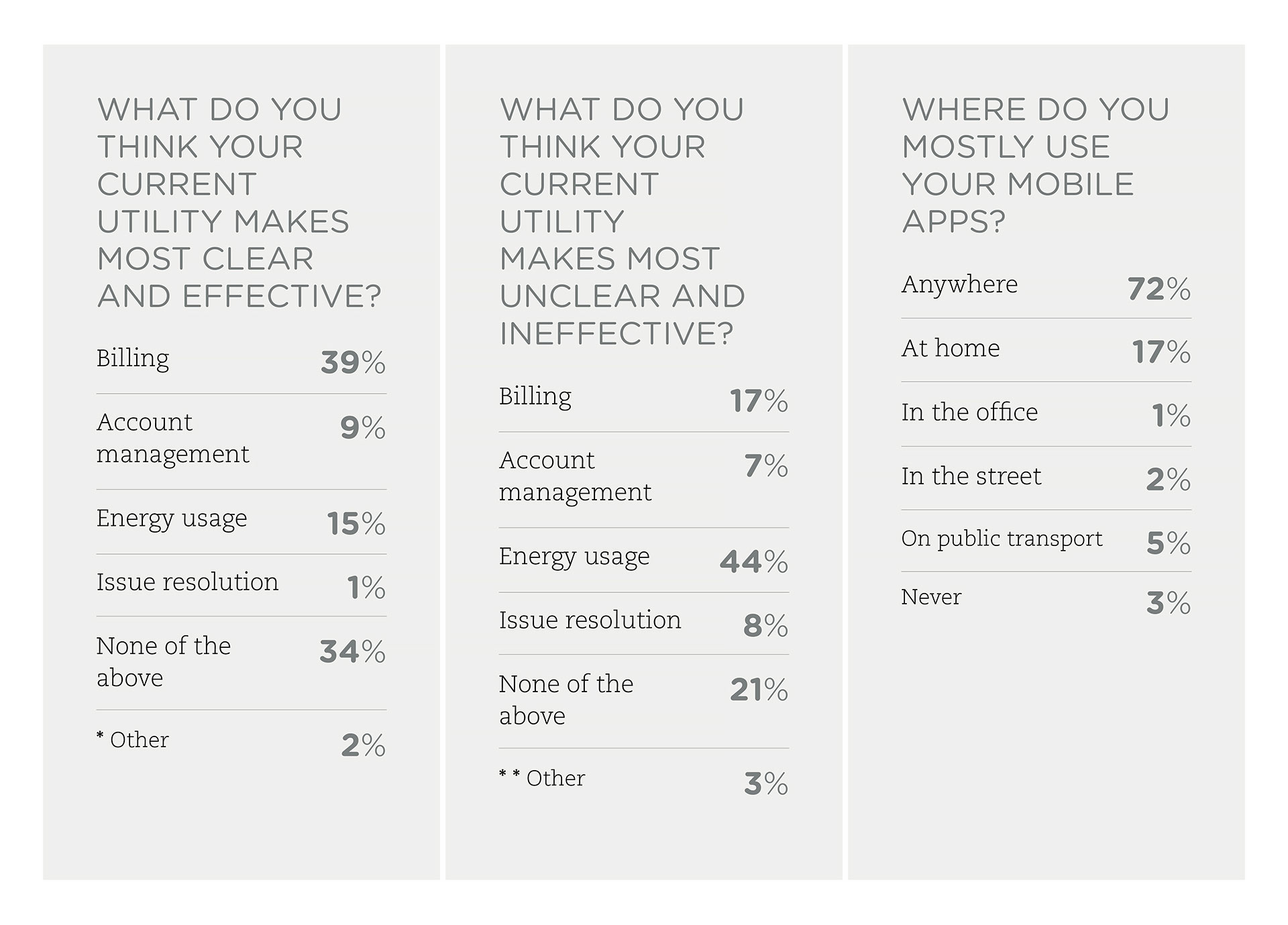
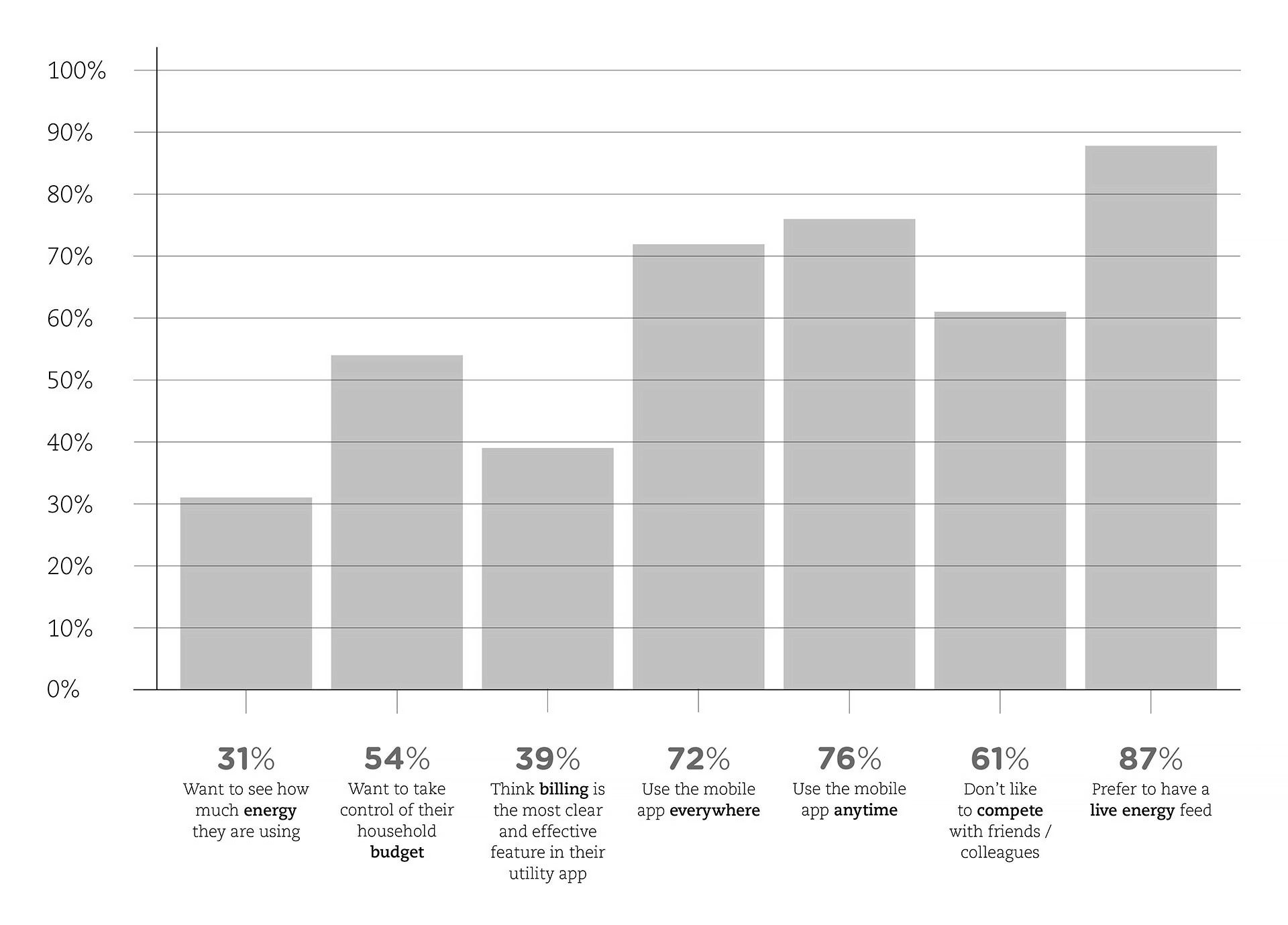
Firstly, two questionnaires provided us with useful feedback from both colleagues and potential users. As a result, we got a total of 131 responses from 8 different nationalities with an age range 18-40, highlighting an immediate access to live energy feed as well as budget control.
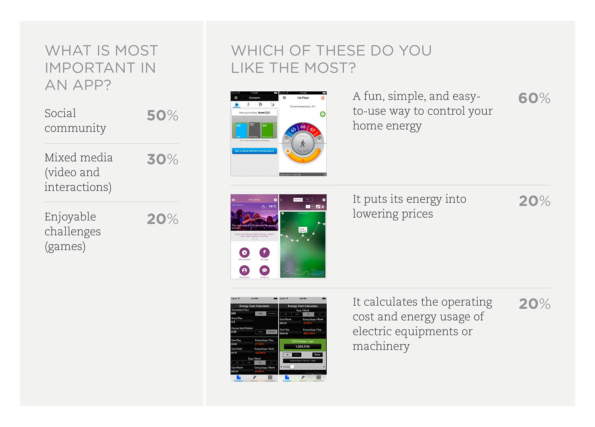
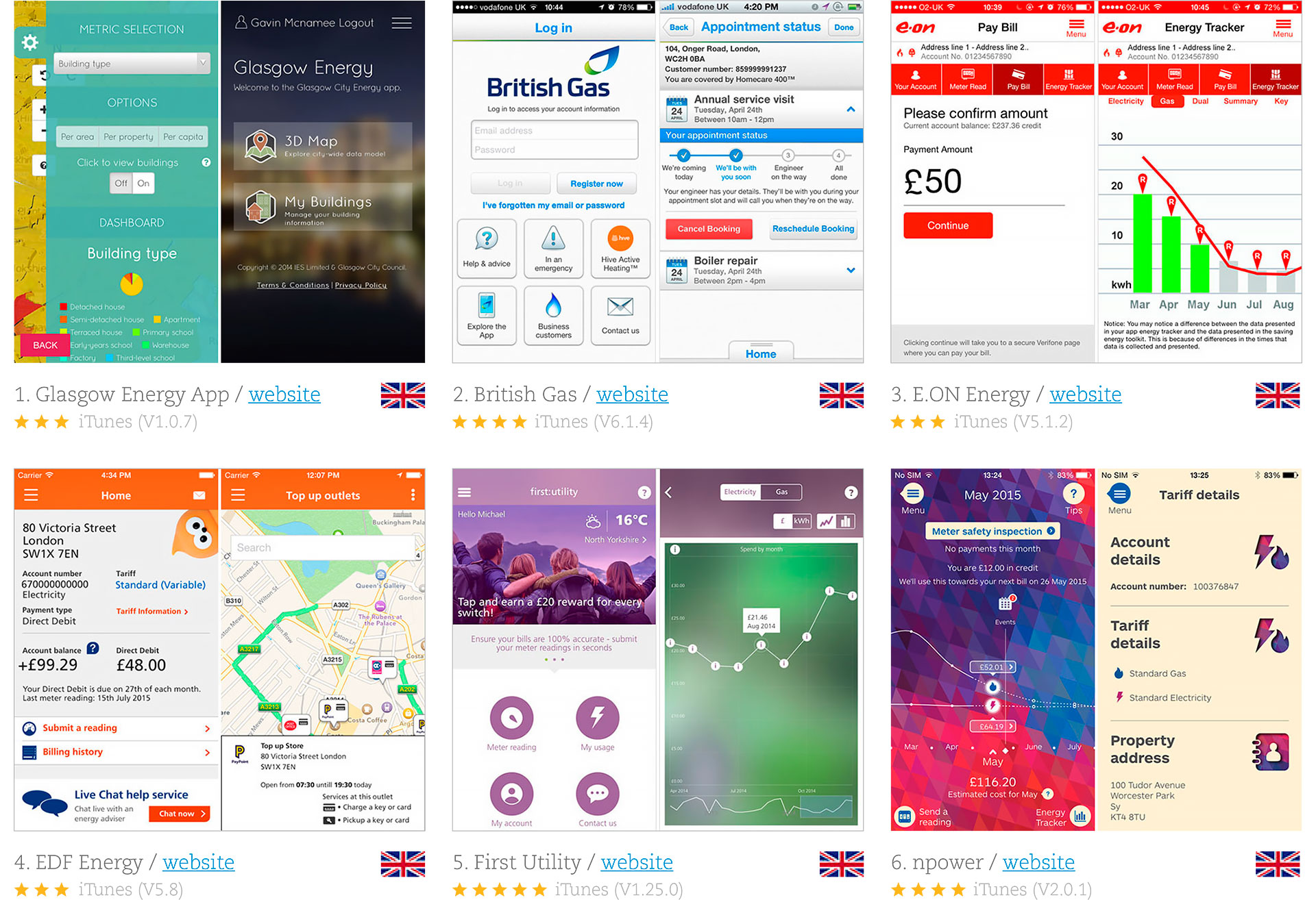
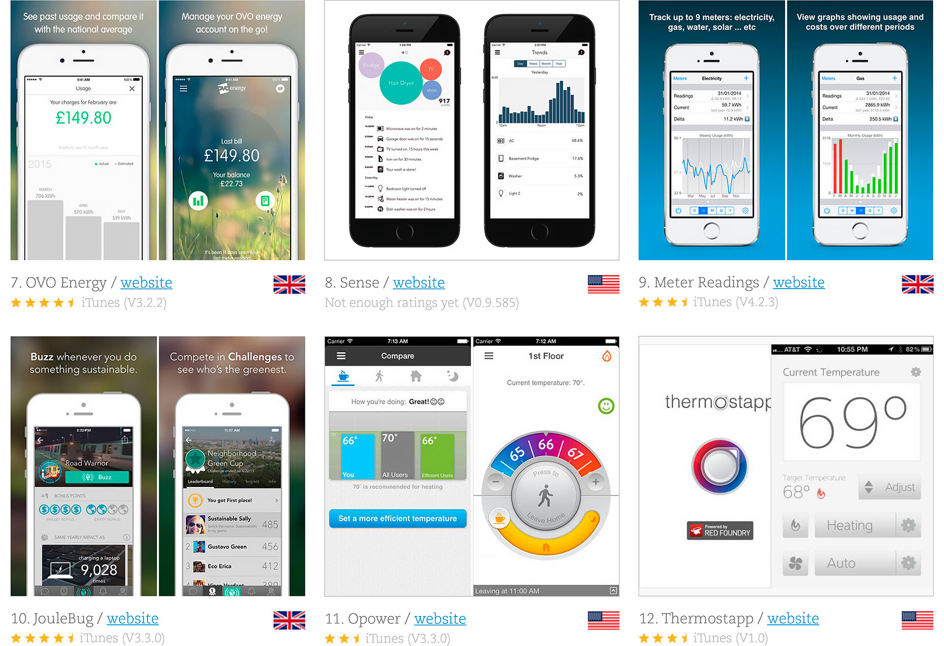
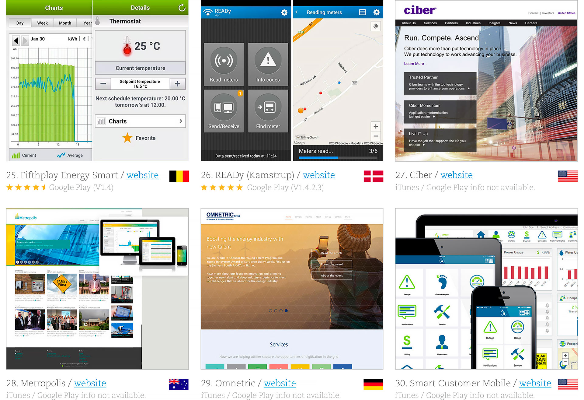
More than 30 energy saving apps from 8 different countries served as competitor analysis, each one with its own data sheet (brief description, rating scale and website). These examples were especially relevant as inspiration in UX/UI design.

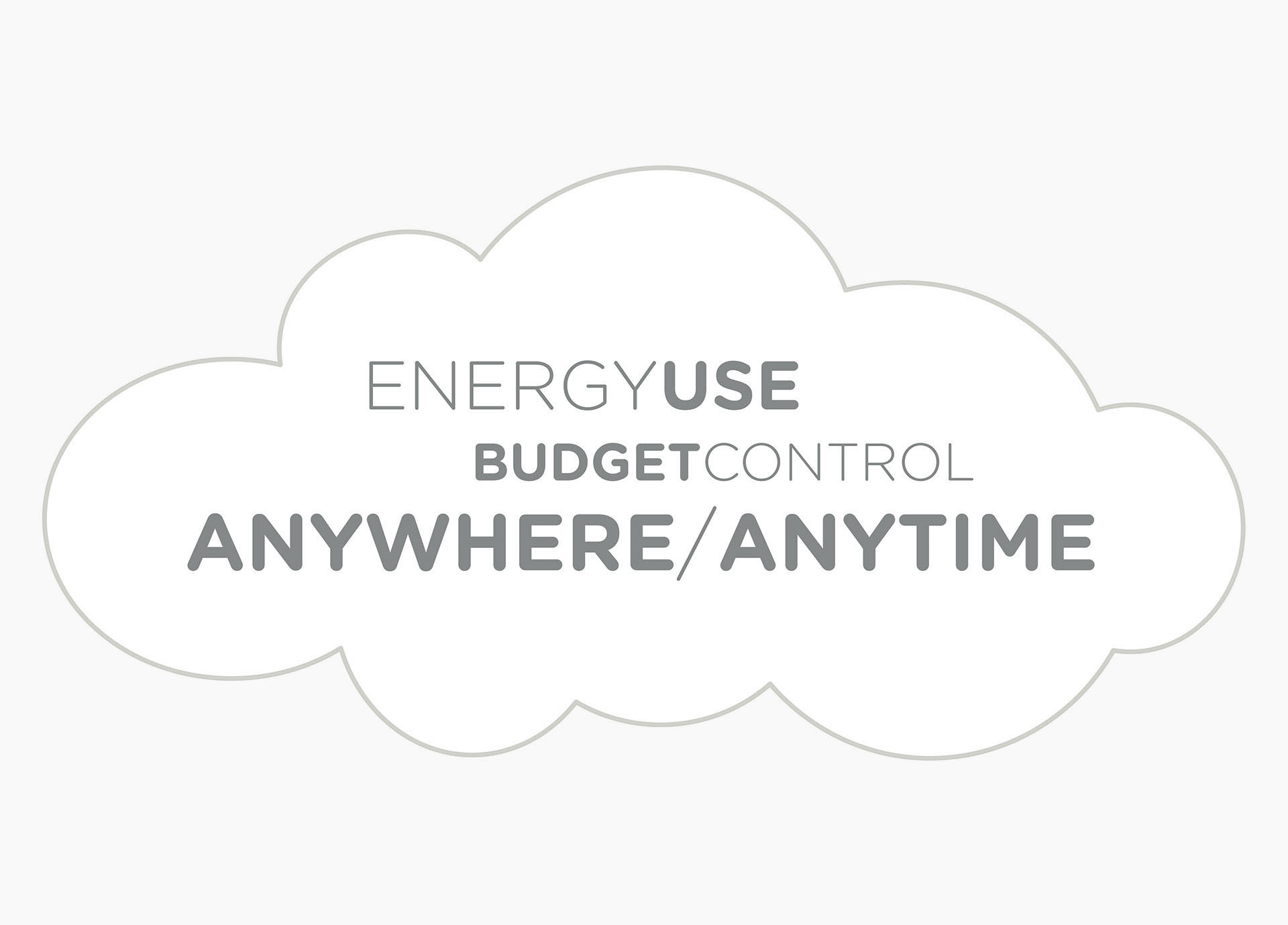
Market research helped us identify the audience and run some quick research on. Customised content, behavioural targeting and engaging challenges create a smart energy experience 24 hours a day in the pocket of customers. The user scenario takes place anywhere, anytime: on the underground, in the street or at home.


After conducting a series of interviews, we were able to identify a set of metrics that we used to define two audience personas: 1. Primary: families and couples who use a smart meter for electricity and gas; 2. Secondary: stakeholders ranging from 18 to 40 (young adults).


Strategy
We started with brainstorming sessions to reward ideas and maximize productivity. They were crucial to find the best and most complete decision for a plan of action, receiving more than 82 comments from all the team.
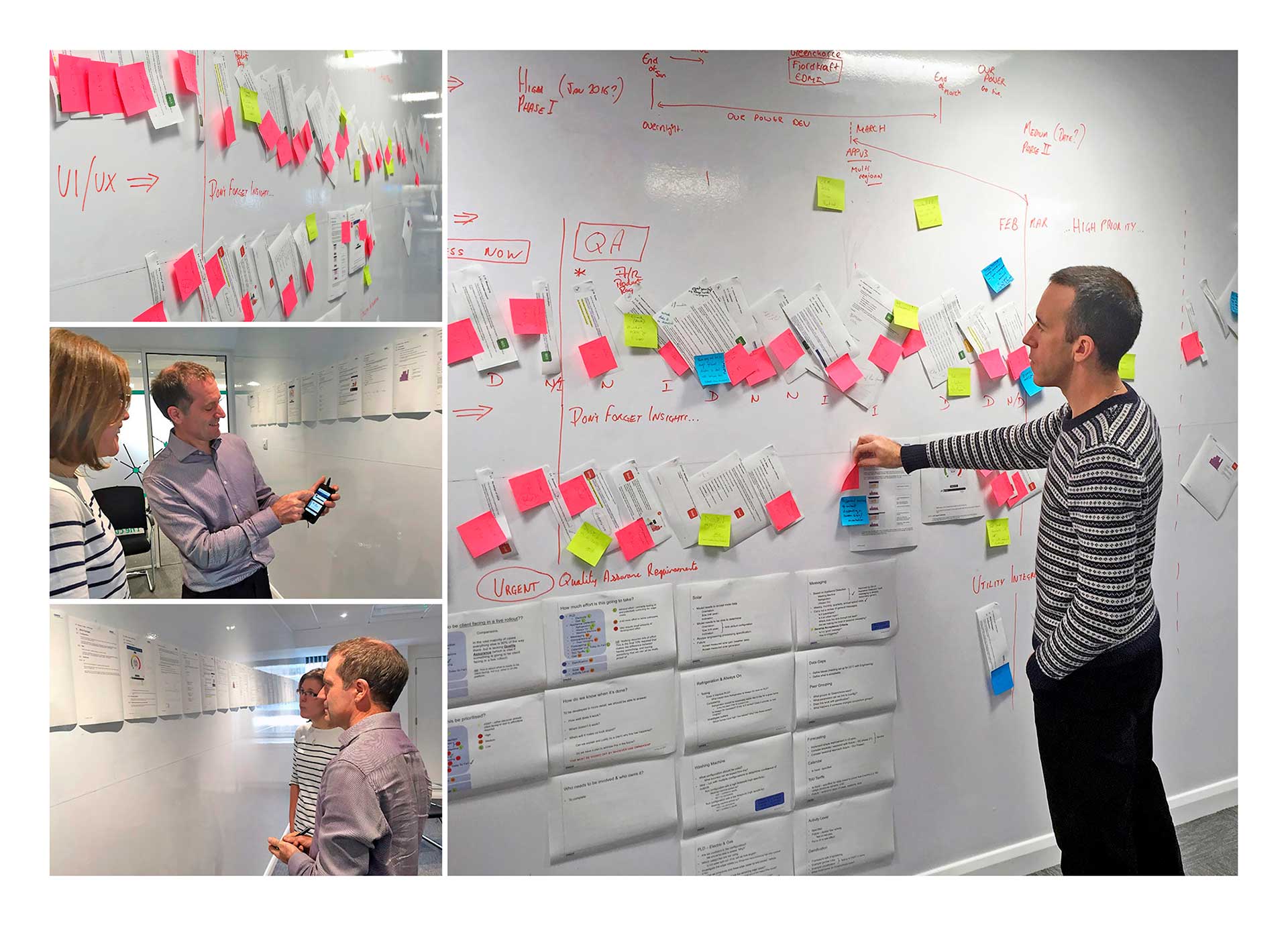
The design process continued with the definition of specific goals: 1. Engage new users via customised content and behavioural targeting / 2. Reduce in-bound calls and create personal relationships with our customers / 3. Communicate complex data information clearly and efficiently.
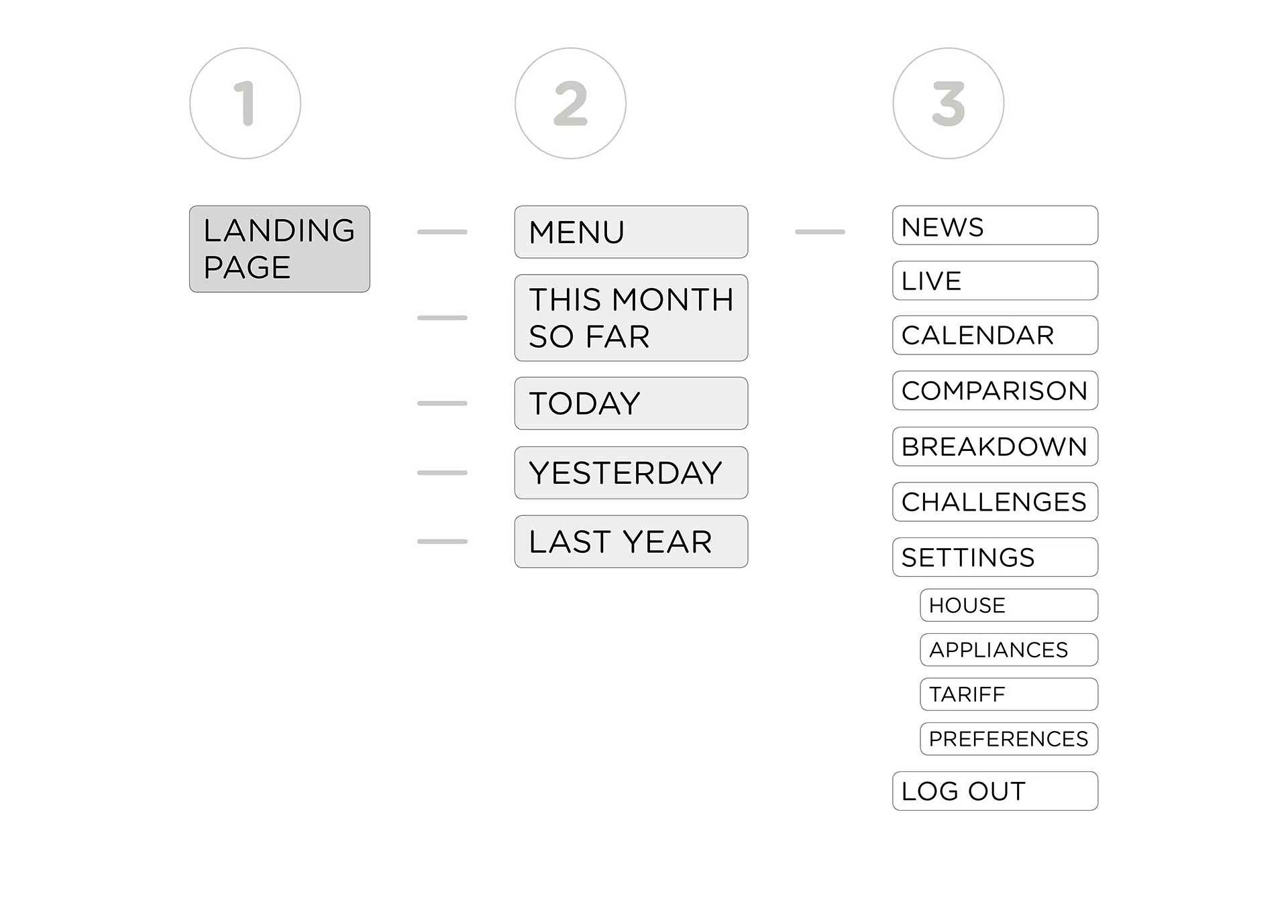
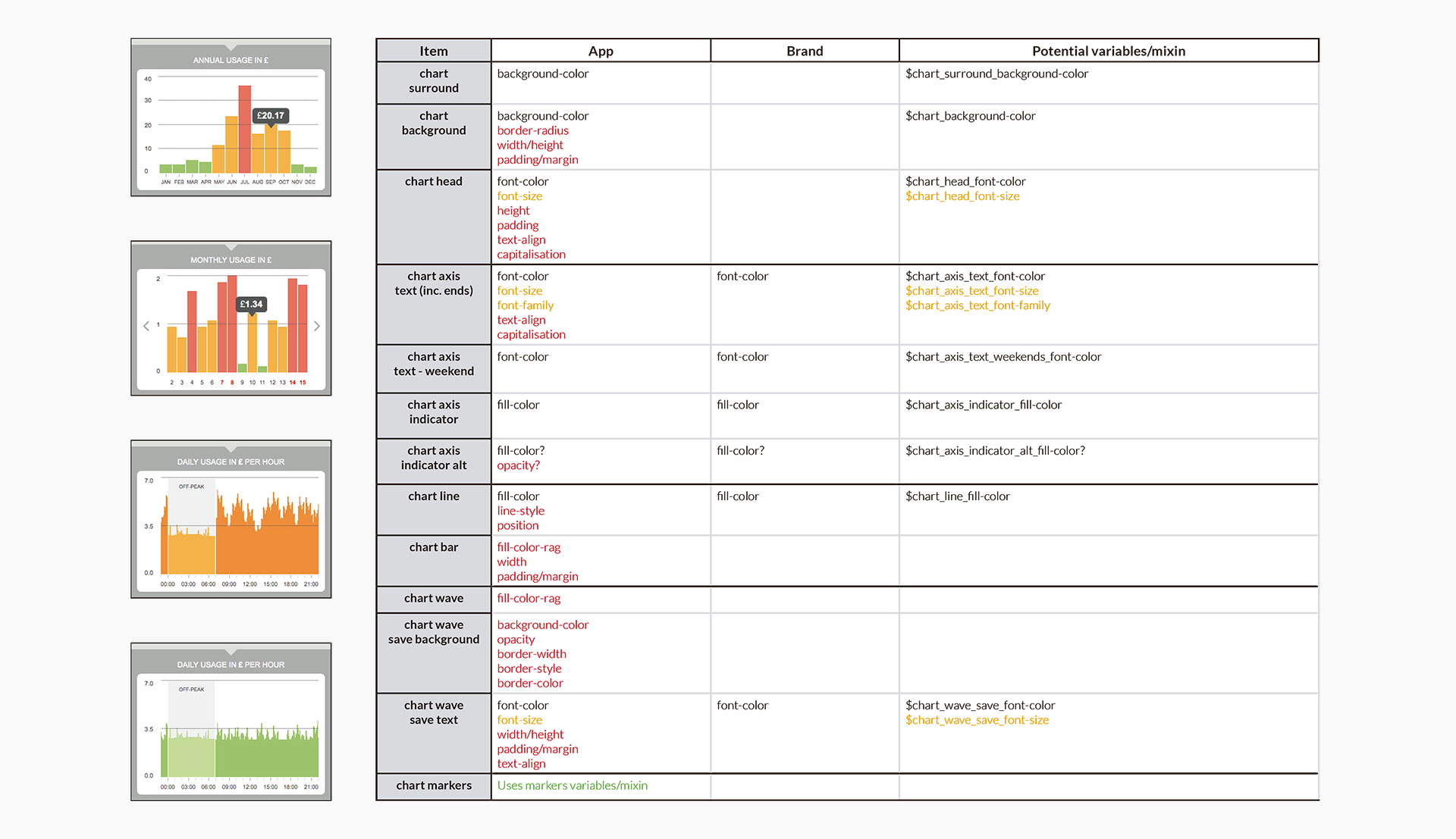
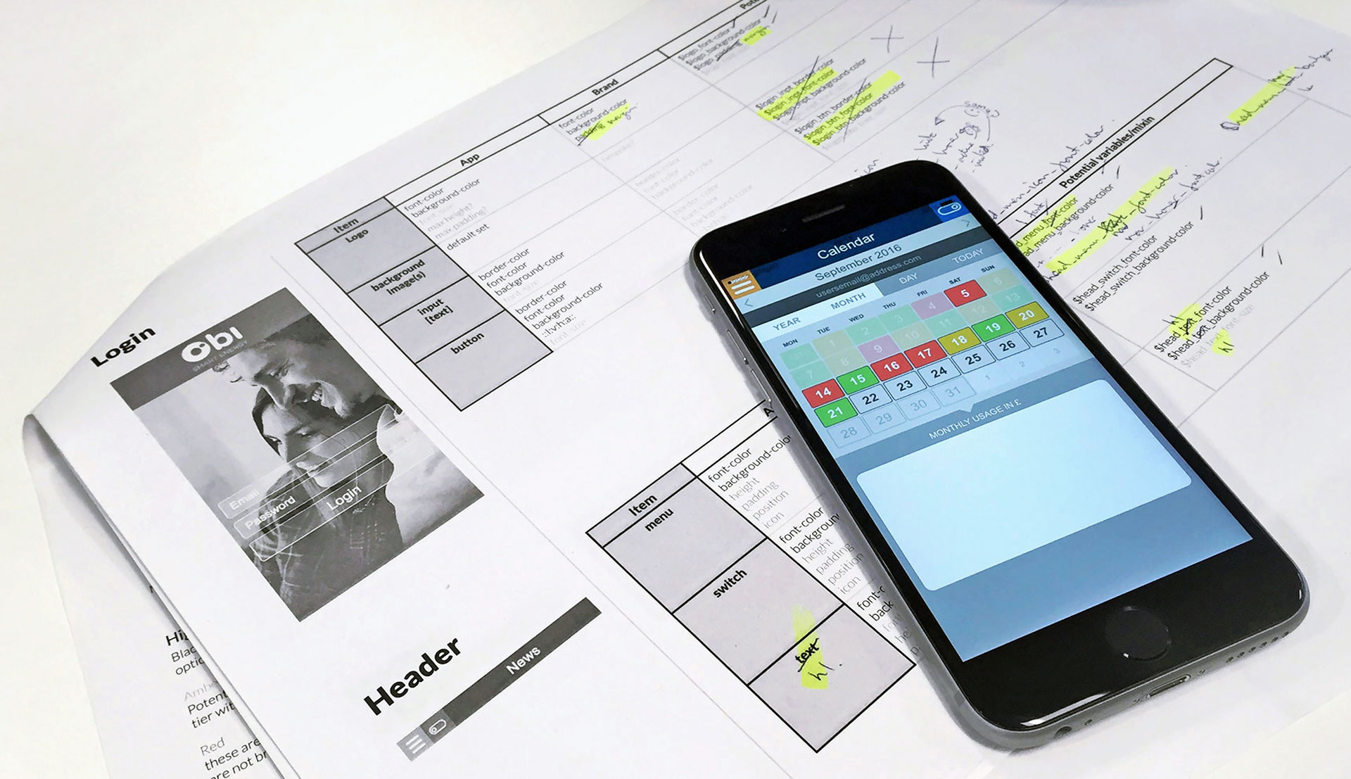
On the other hand, information architecture according to the following characteristics: terminology (what people call things), relationships (proximity, similarity), and categories (groups and their names).
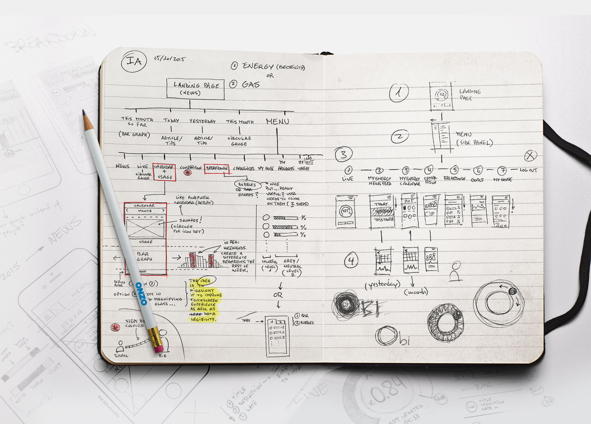
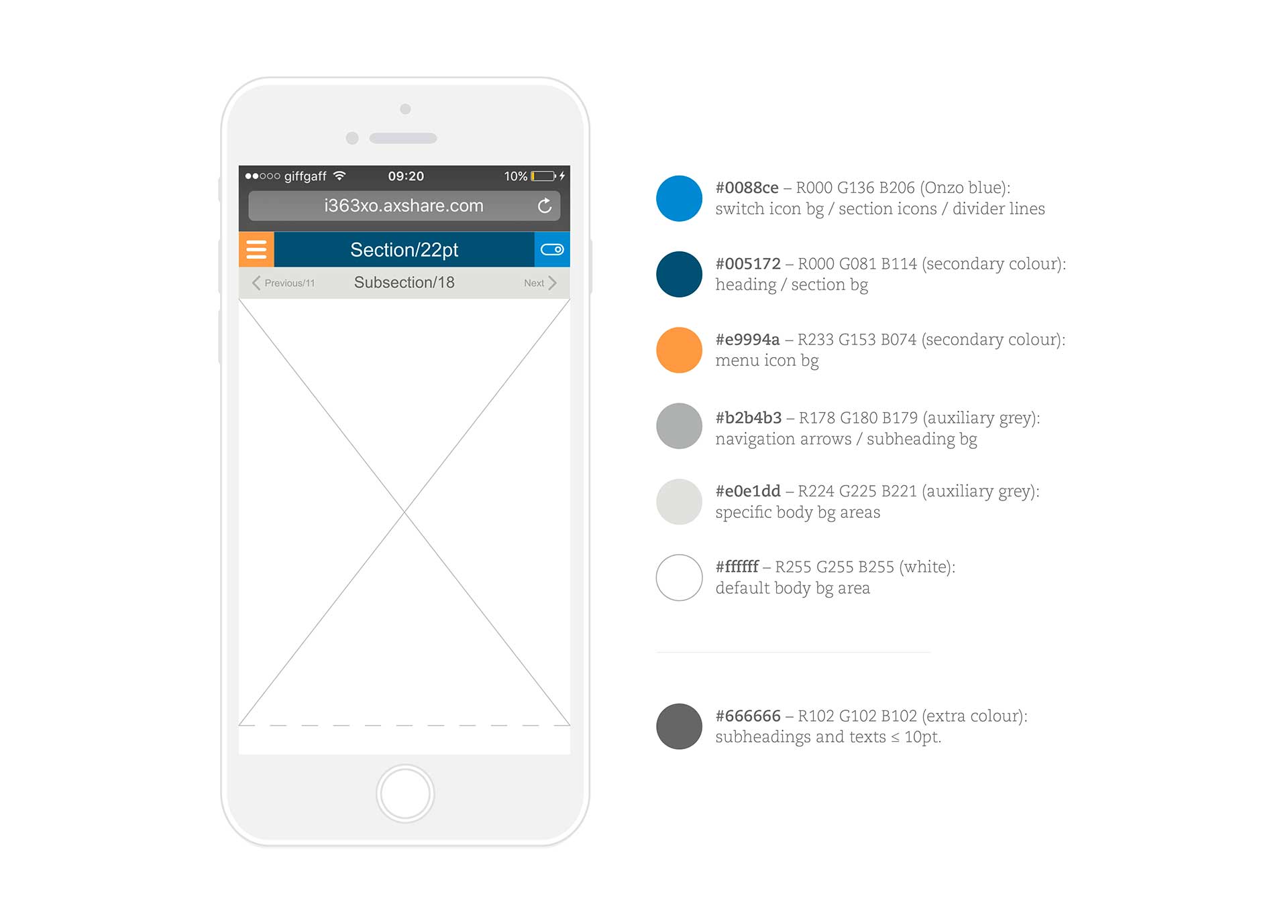
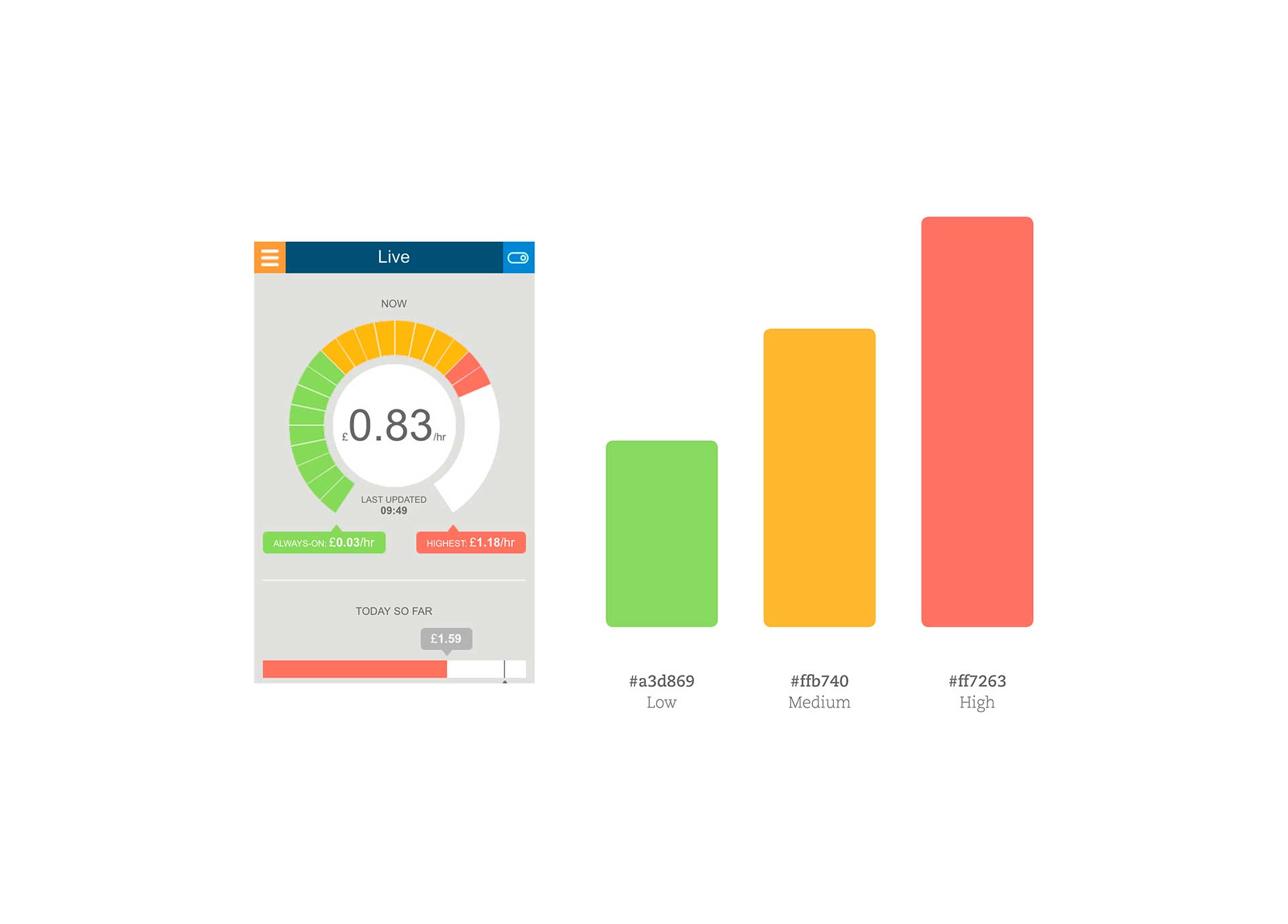
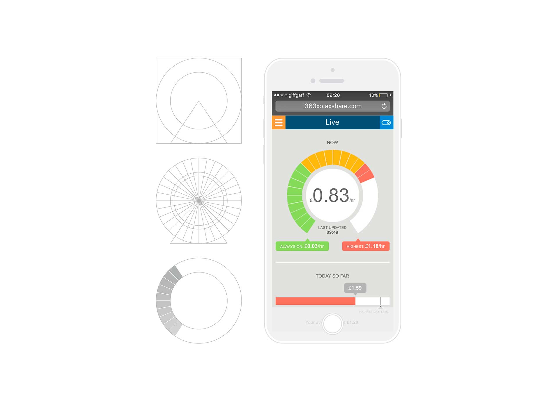
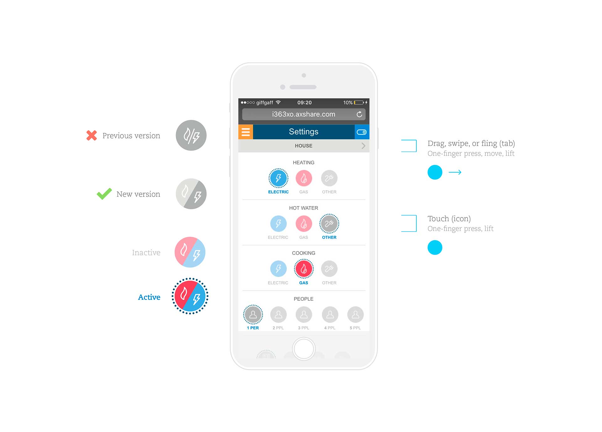
Design guidelines provided a manual of strategies especially focused on the visual language: 1. Layout: key elements of UI. 2. Colour palettes: Corporate, common elements used in the interface; RAG system, based on the energy consumption (R red-high, A amber-medium, G green-low).
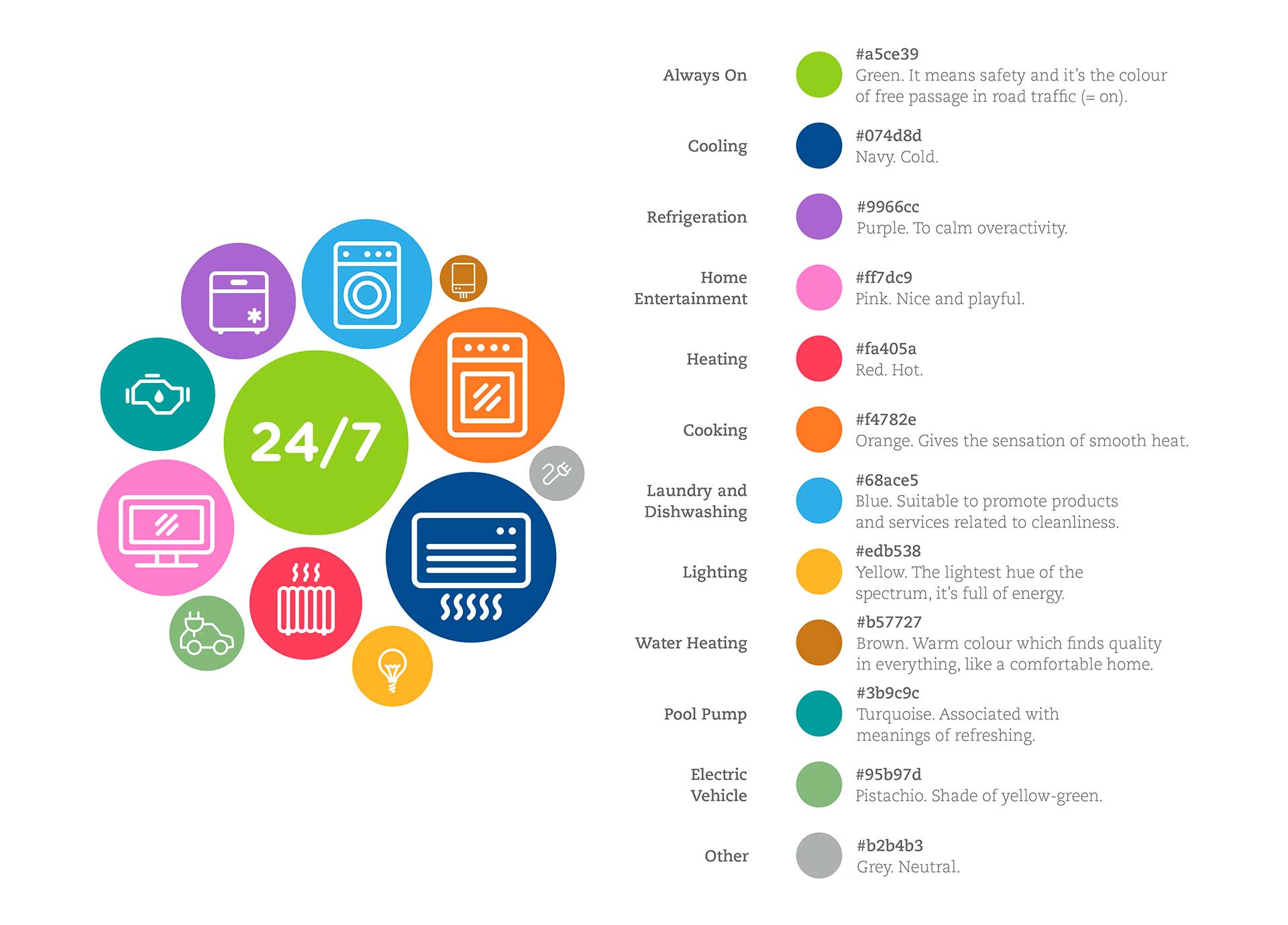
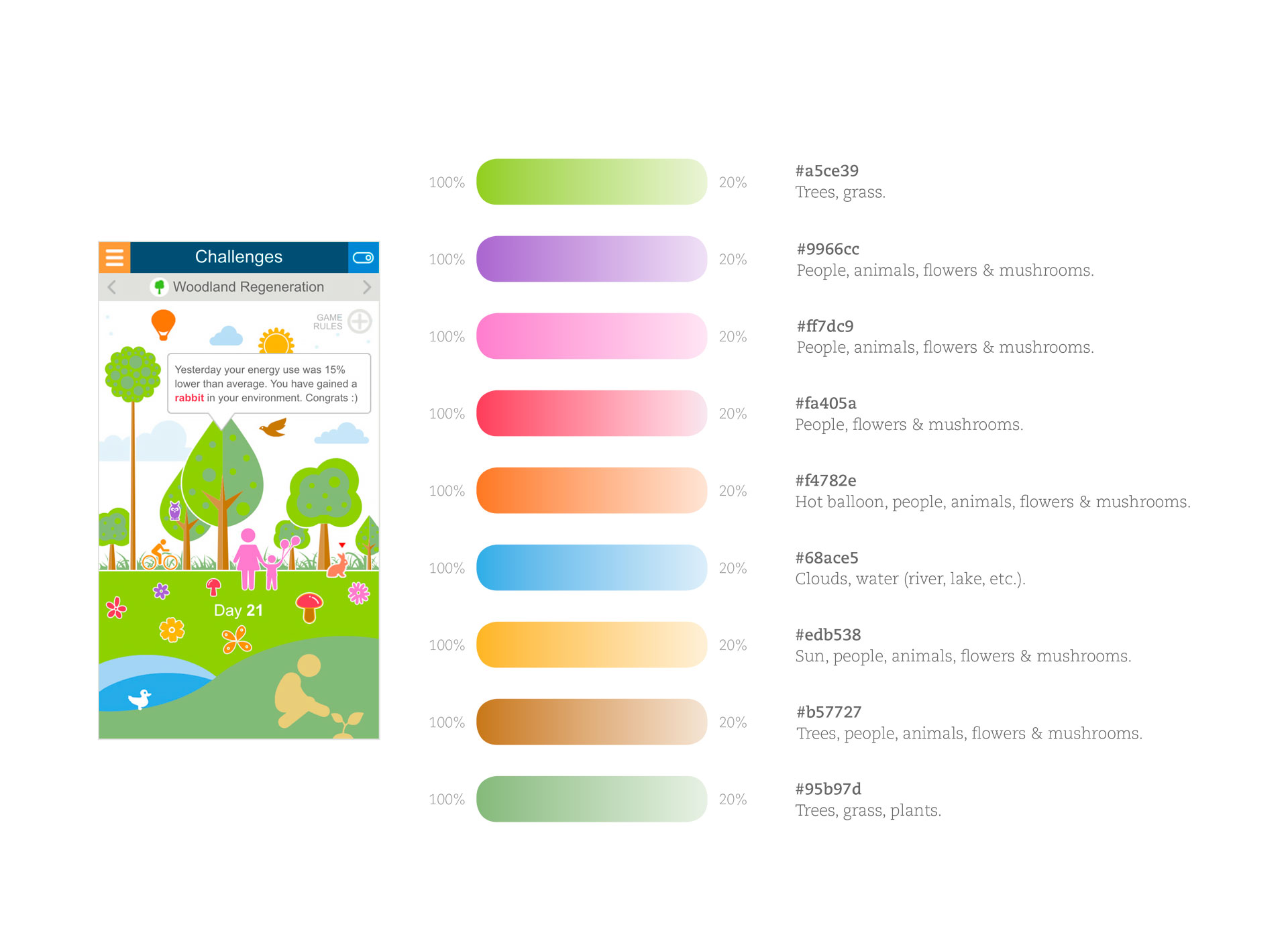
Appliances icon set, where each colour is selected according to a meaningful message in the context of the appliance’s category; Challenges, with those colours based on linear gradients by using different percentages to create a good tonal balance.
Design
The first step was a new identity, and Obi (On Board Intelligence) was the best name among 6 in total selected for user testing in 4 different market categories (association, object, character, thing).
Letters “b” and “i” come from the company’s corporate family font (Gotham Rounded Bold), while the capital “O” comes from the company’s logo. The dot over the letter “i” reminds an indicator pointer of a thermostat once it’s combined with the letter “O”.

Below, an exploratory idea linked to energy disaggregation, providing accurate information that might help users save money and time, as it improves load disaggregation by detecting every 10sec component appliances separately from a whole-home energy signal.
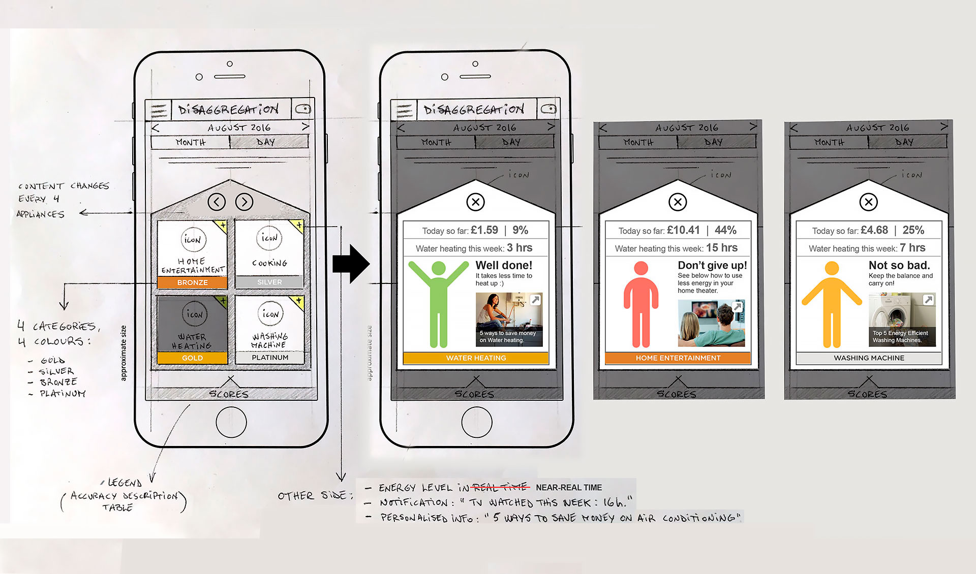
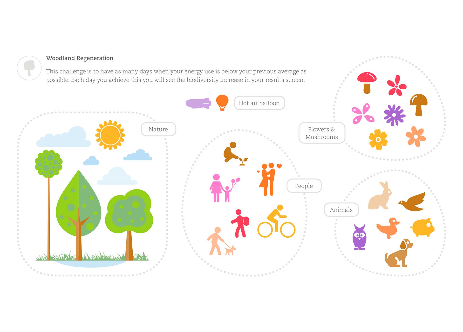
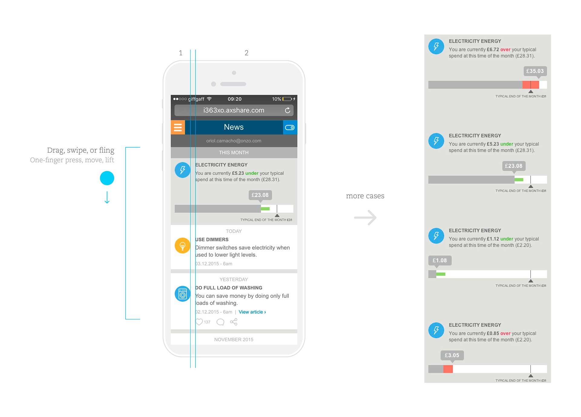
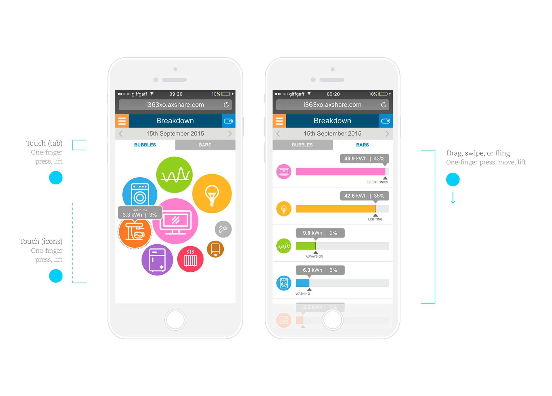
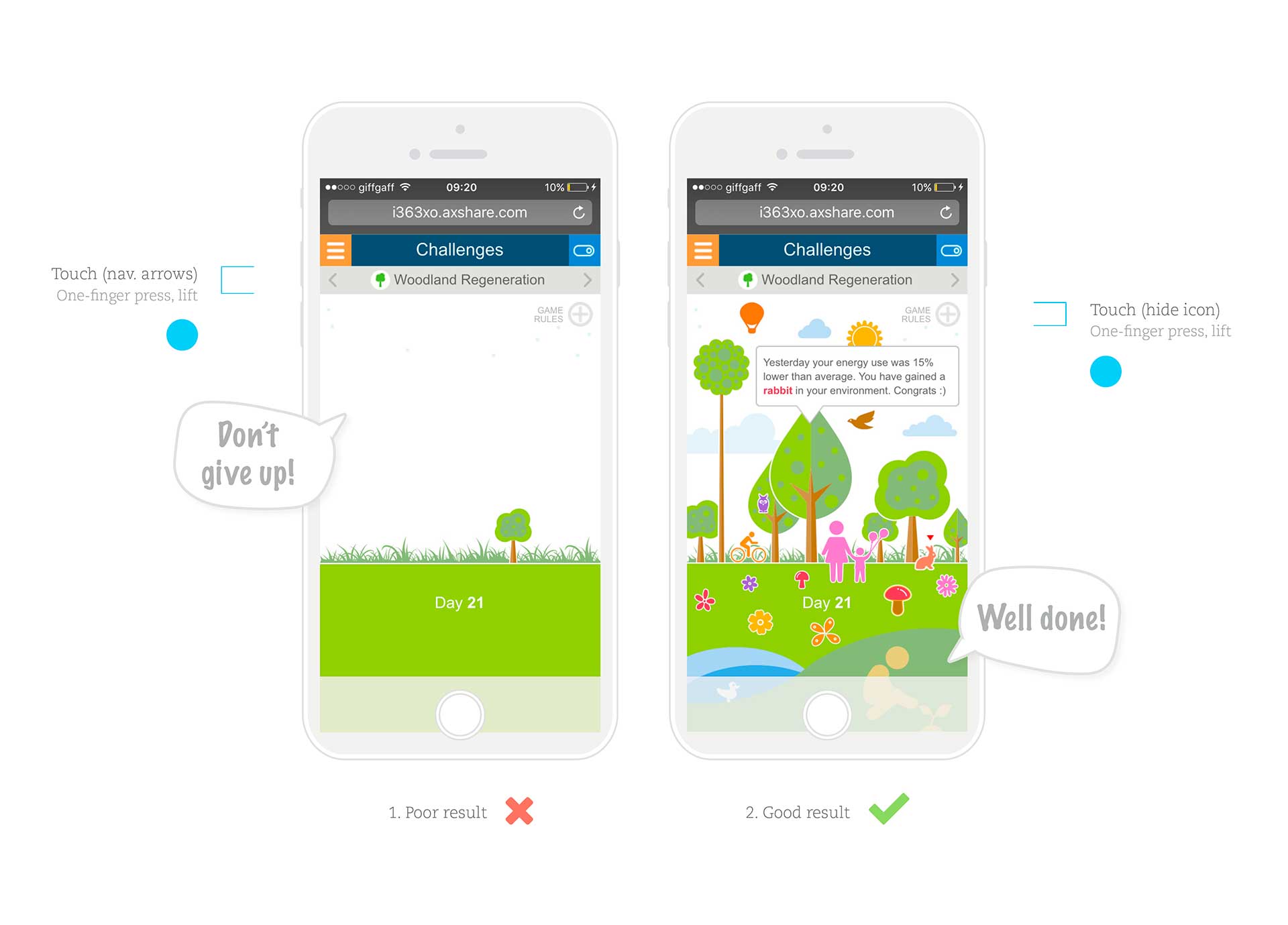
The icon set pays special attention to readability while keeping its consistency through a harmonious family. On the other hand, the Challenges section offers a rich game experience based on placing “stickers” (images), according to predefined locations that are based on the result of the game.
A new sticker is placed when the energy use is below the previous average (same day of the previous month), rewarding good actions by providing customers with coupons/promo codes.
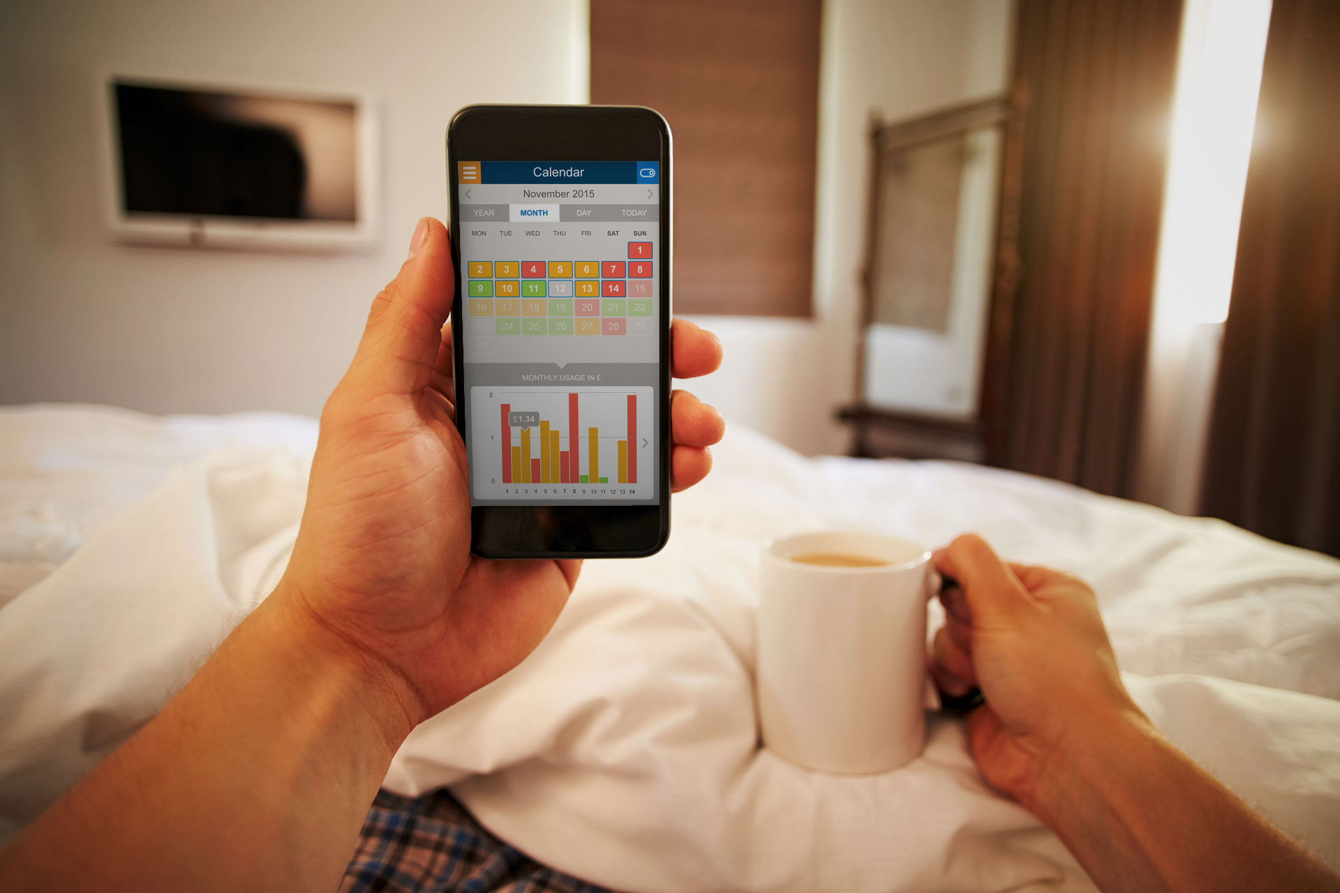
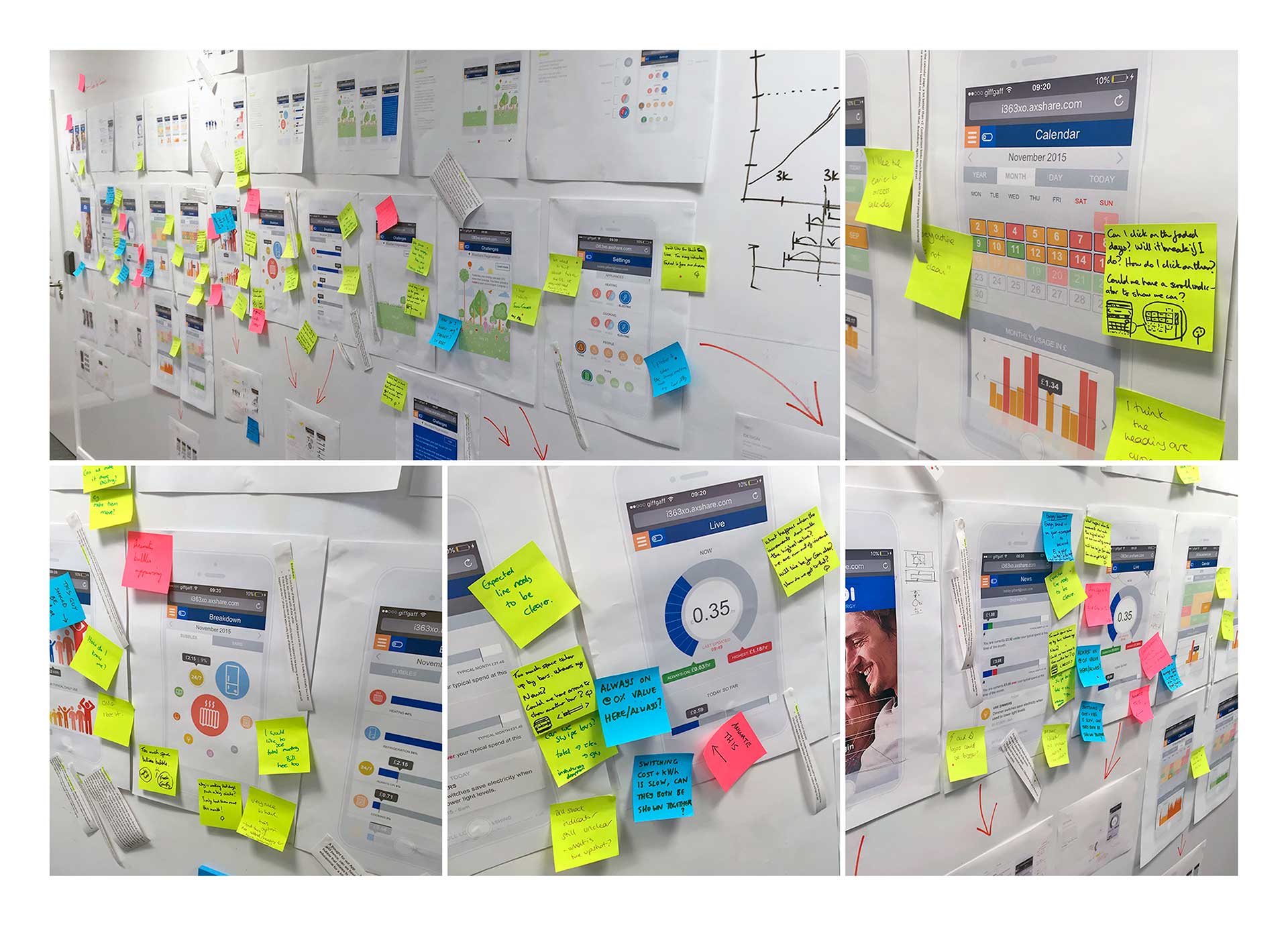
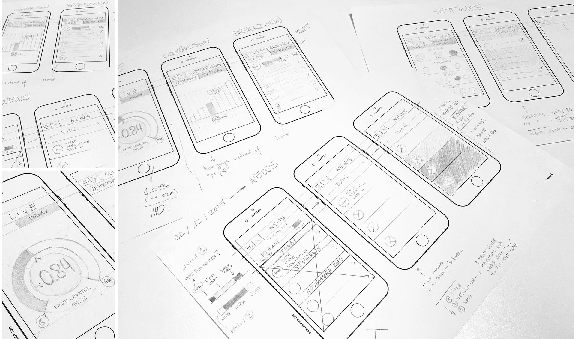
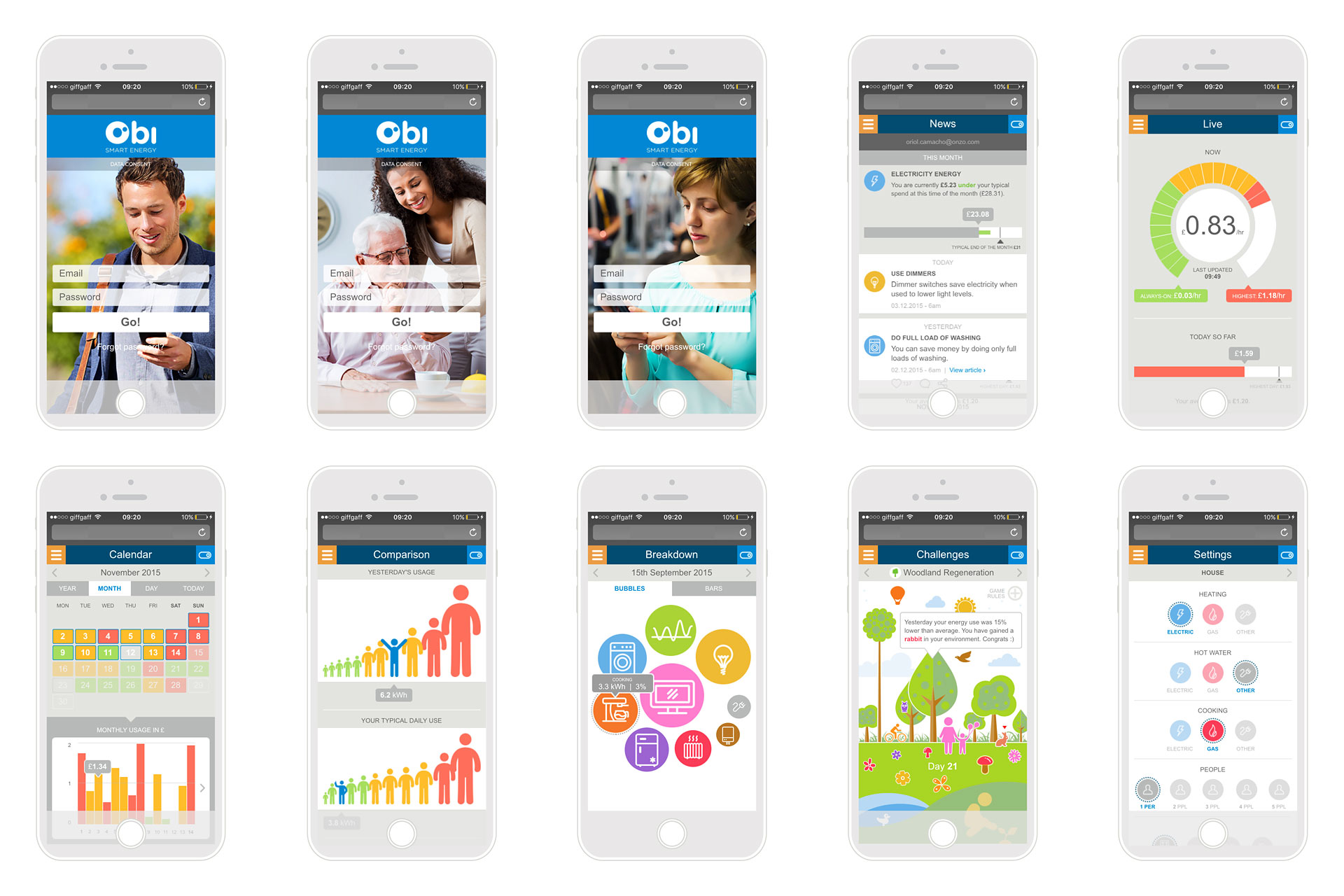
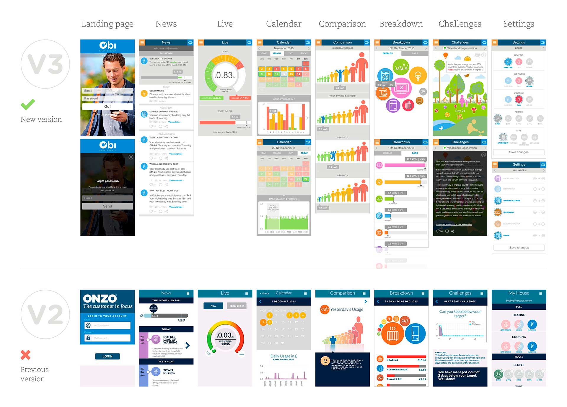
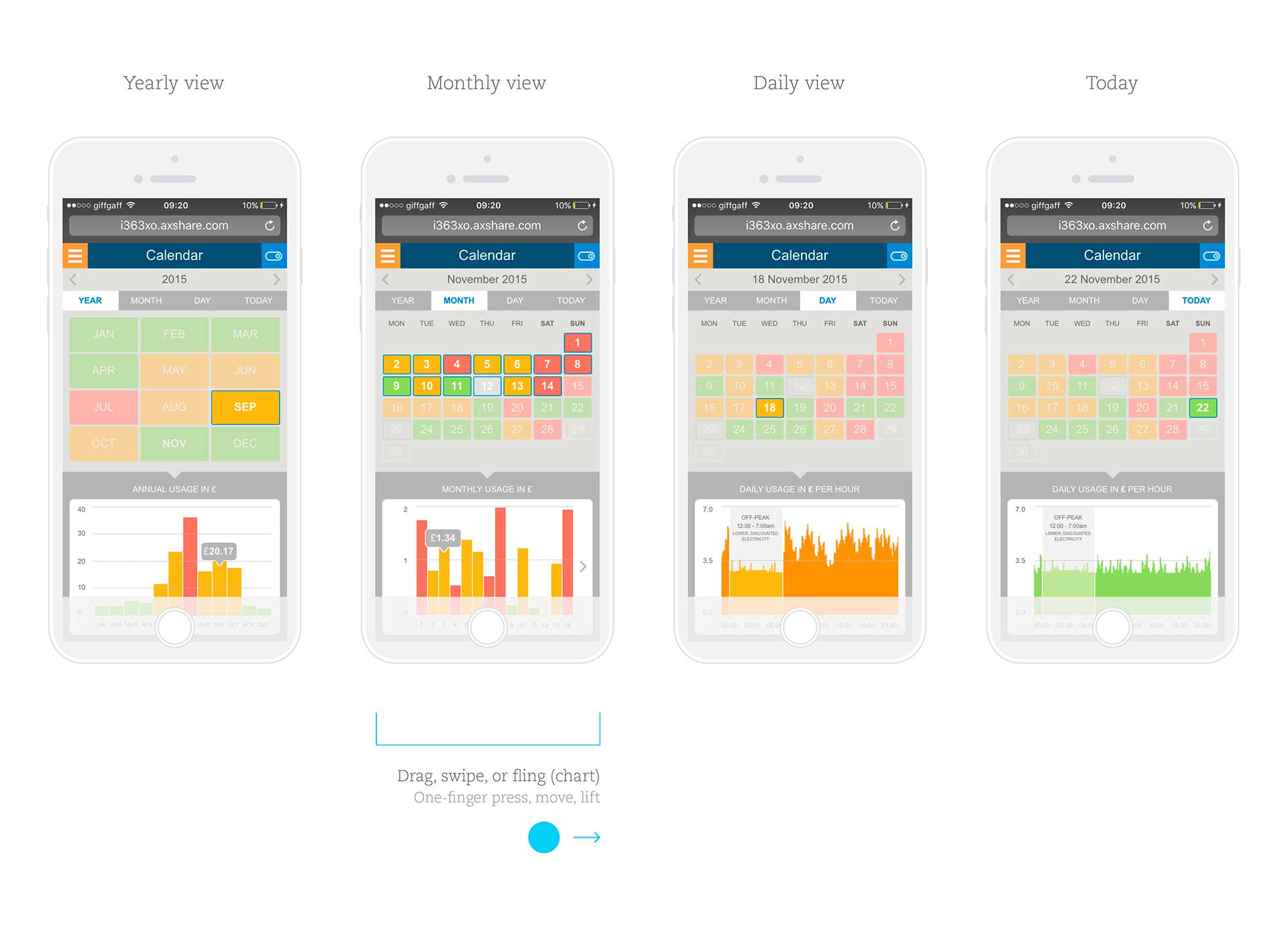
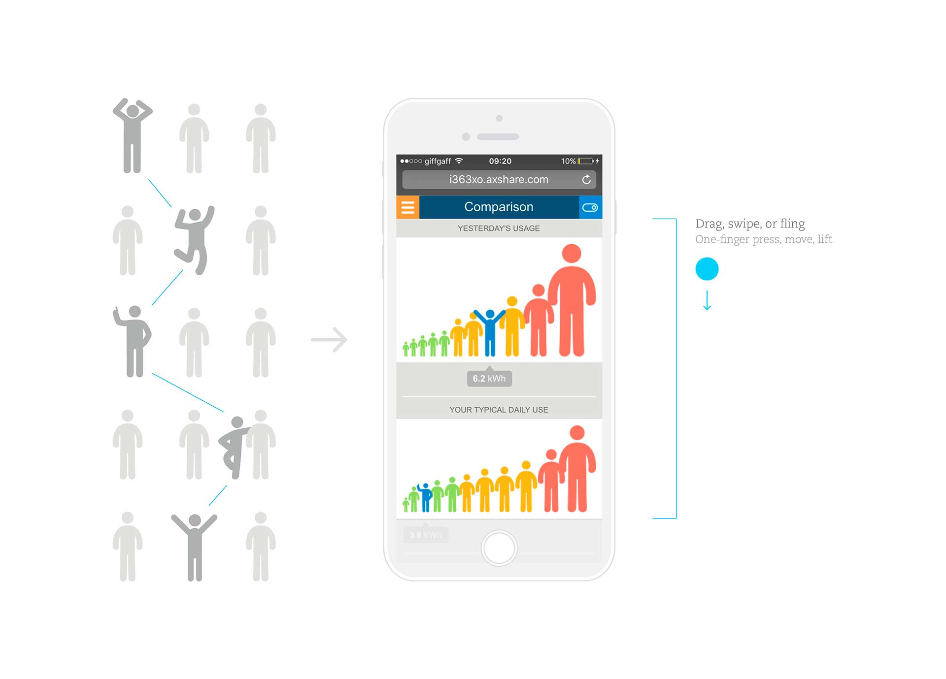
The different screen layouts include richer information compared with previous version (v2), ensuring consistency across screens. Below (left to right, top to bottom): Home (carousel), News, Live, Calendar, Comparison, Breakdown, Challenges and Settings.
User behaviour along with detailed specifications for every screen help better explain all the process while highlighting multiple advantages in this new version (v3).
Development & Testing
We finally created a test version by using a tool called HockeyApp to get some valuable feedback and analyse test coverage. This allowed us to publish, test and change Obi without having to apply or publish through a live app store. This version can be installed on portable Apple devices once the device is registered via a web-link.
Evaluation
A high-fidelity prototype that feels real was shared at European Utility Week. As a result, we gained equity funding from new investors as well as new customers, improving company profits. In addition, this project was also awarded in The European Talent Awards 2017 – Aquent (finalist UX category).